AGENCY: MATTER
BRAND IDENTITY / ART DIRECTION / 2025
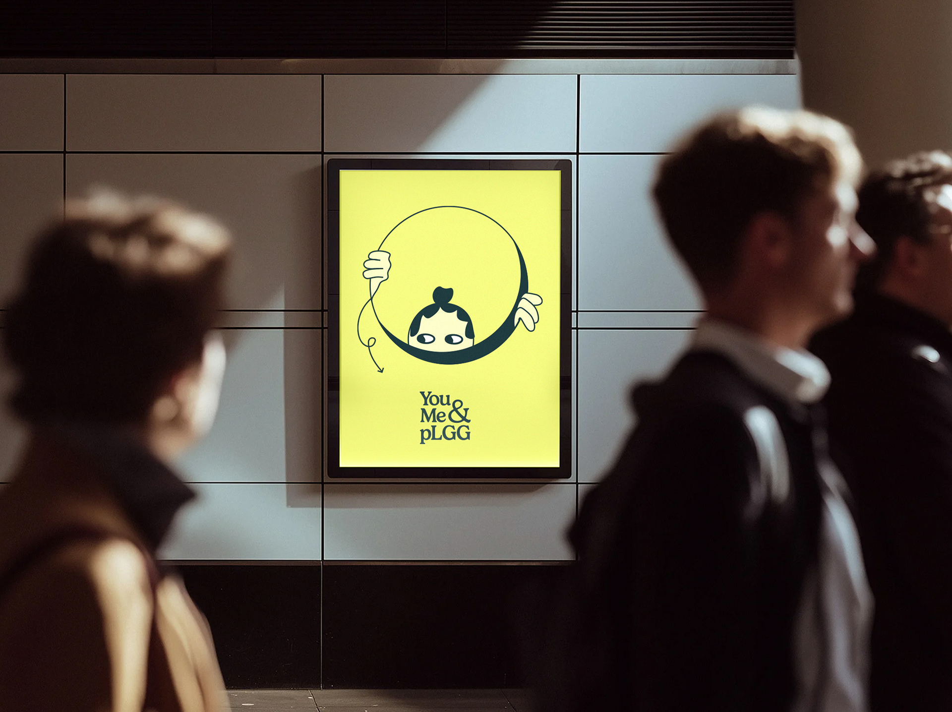
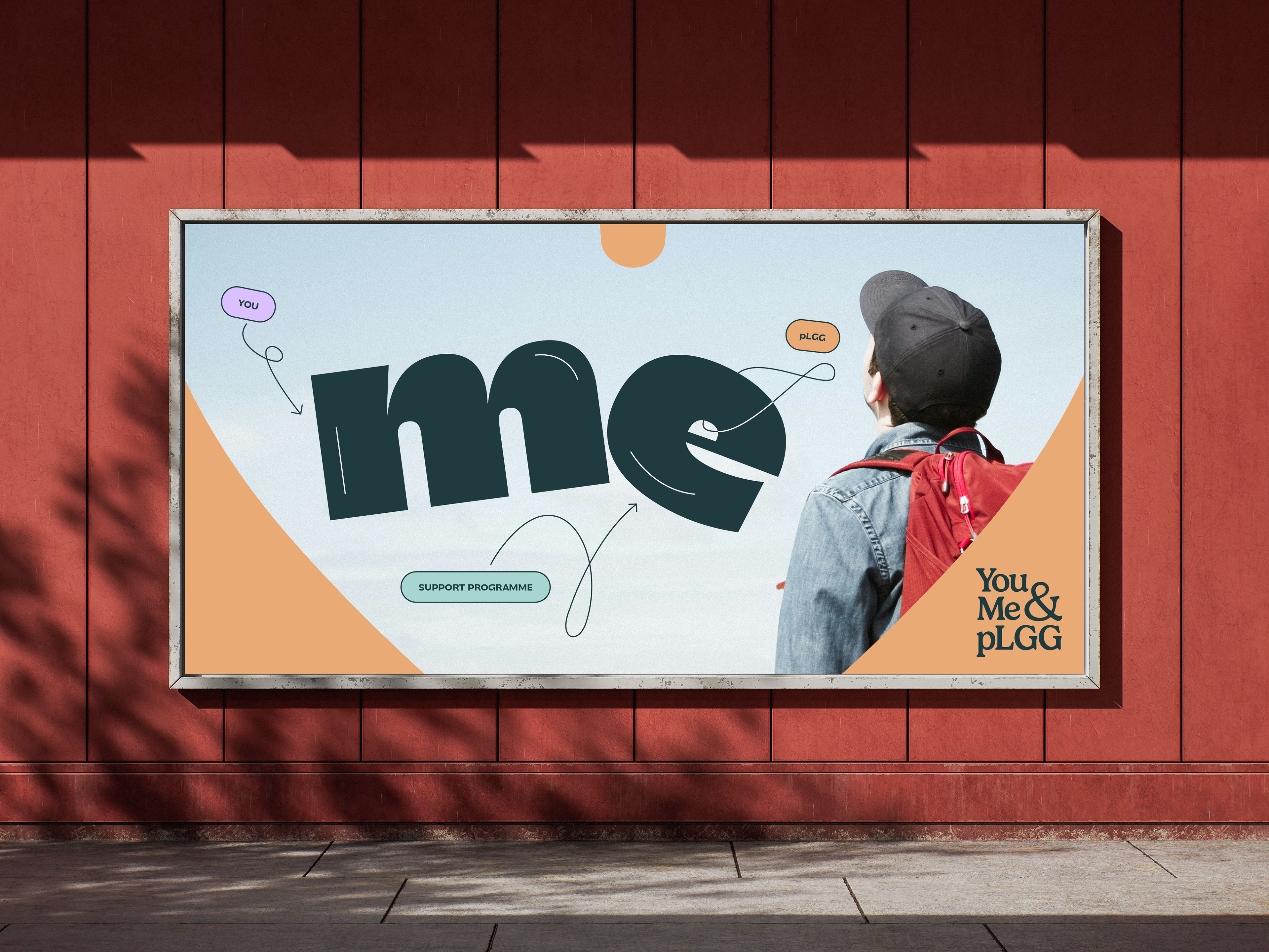
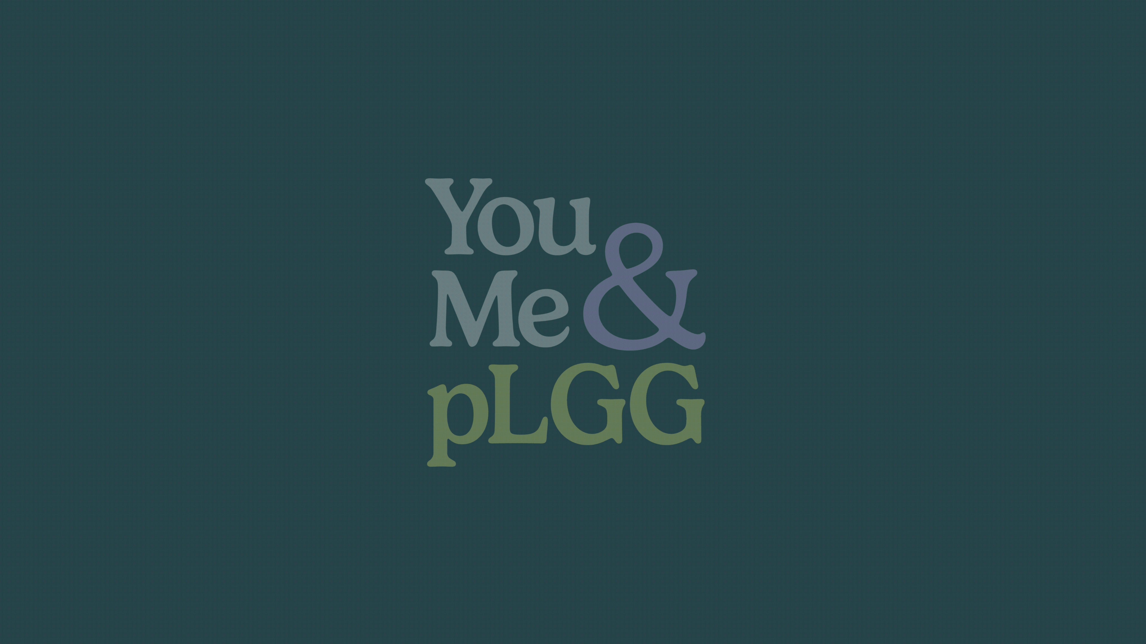
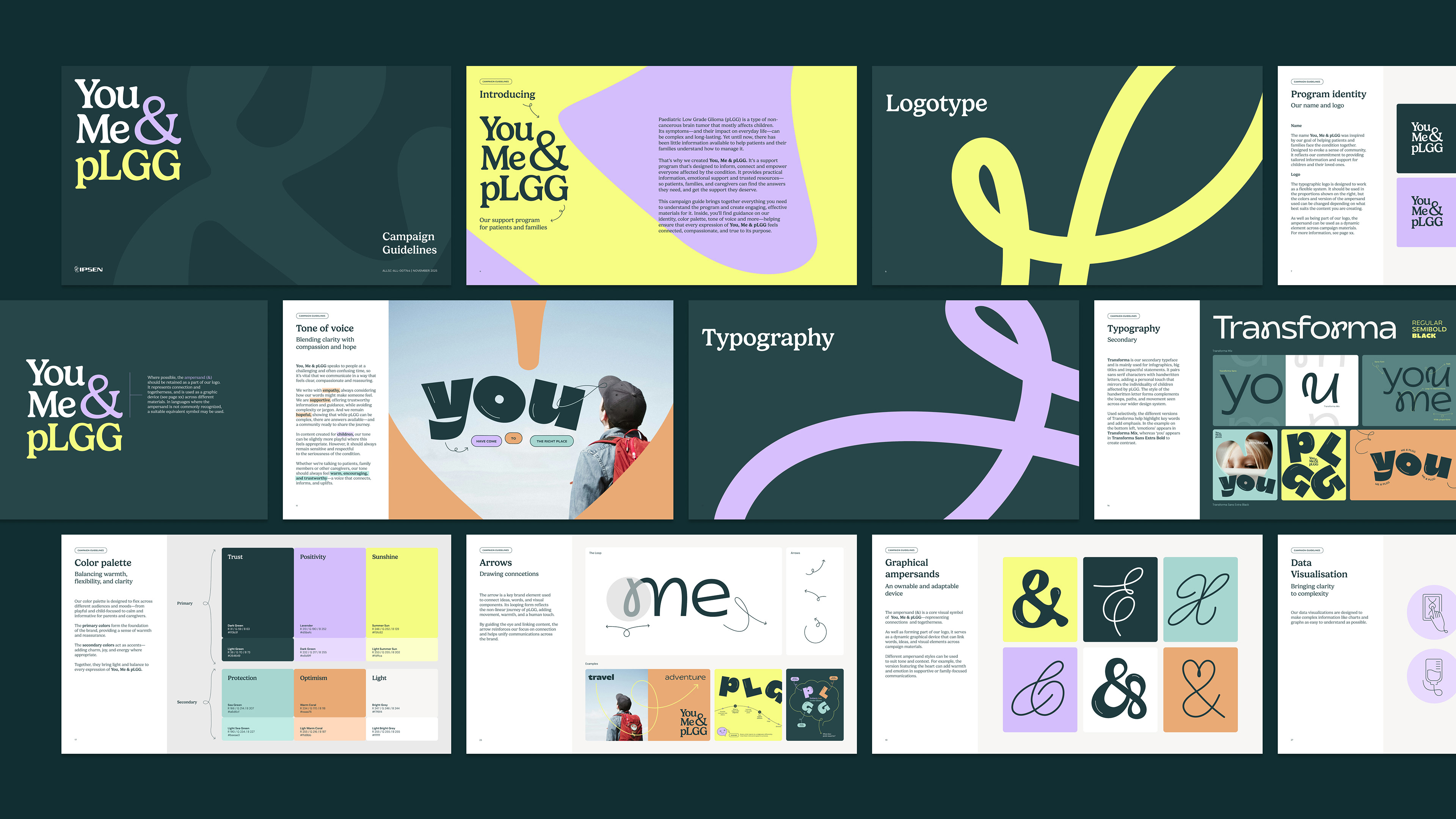
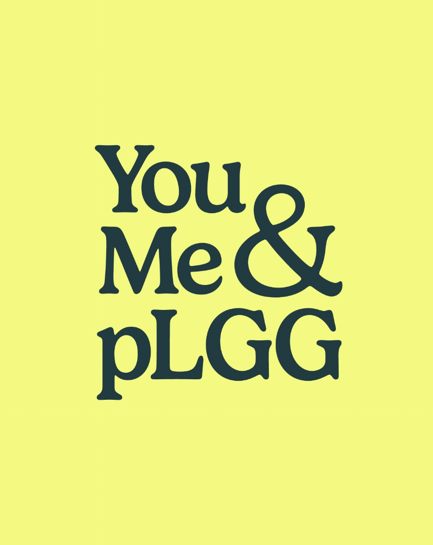
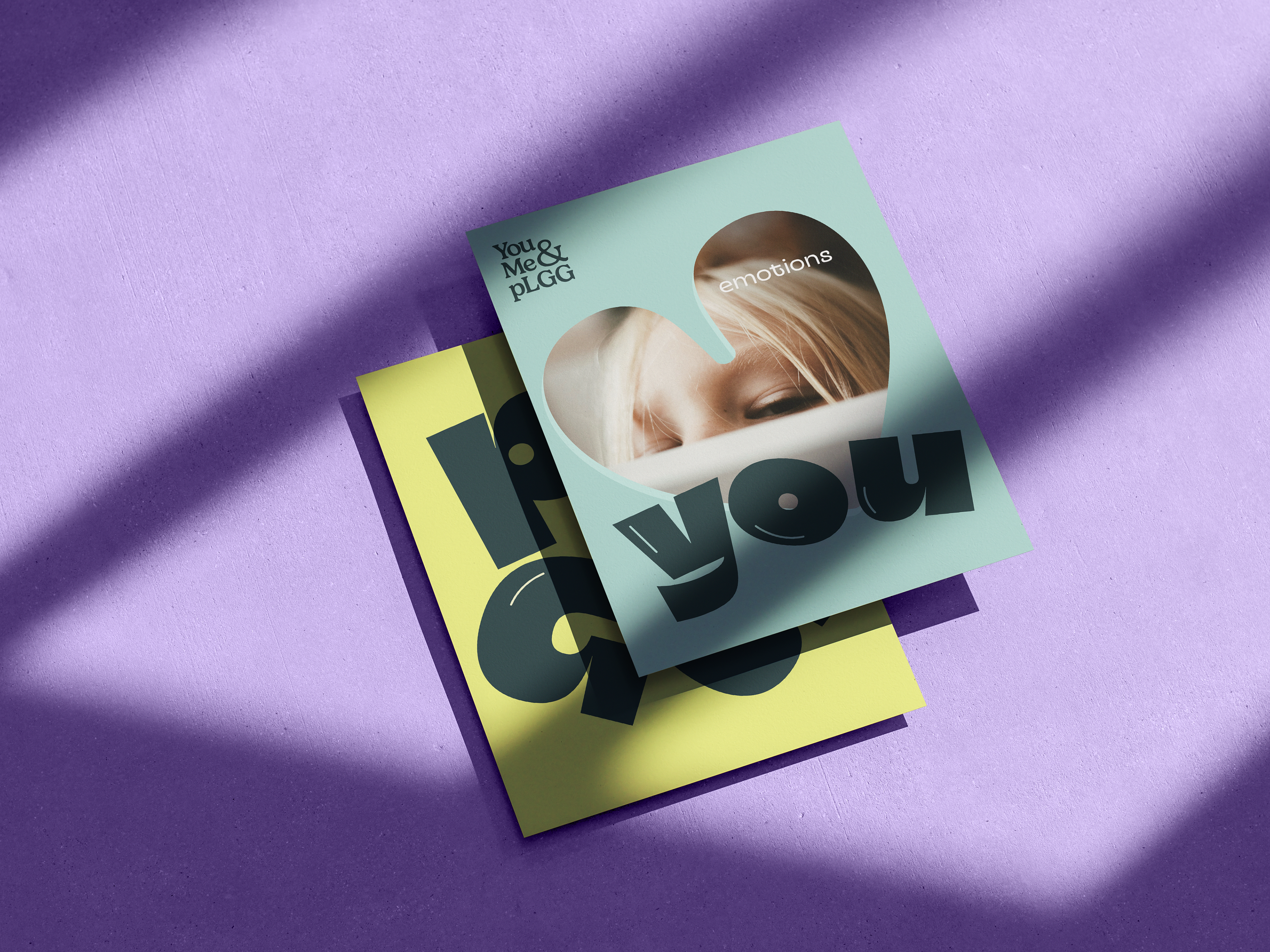
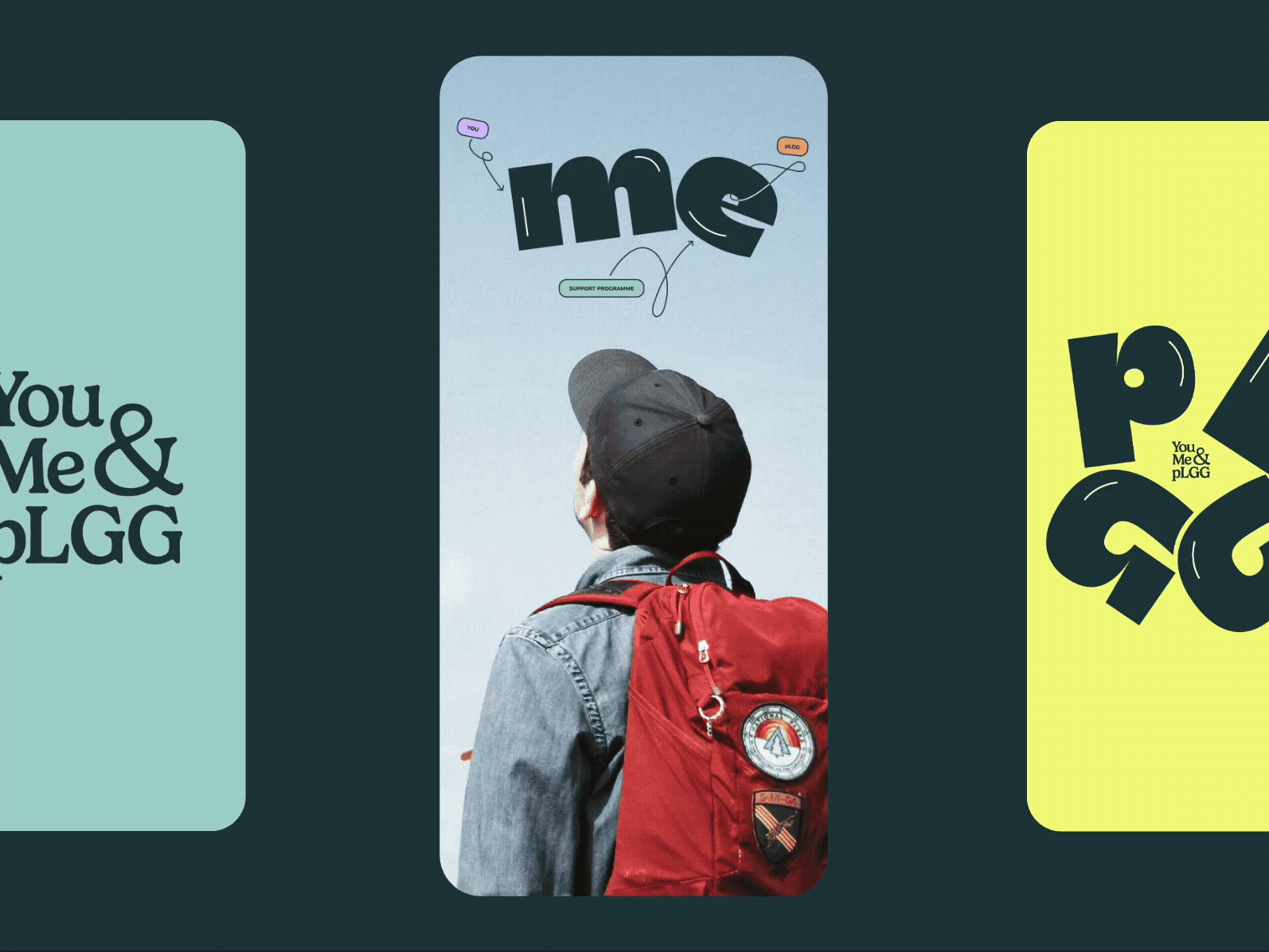
You, Me & pLGG
A full brand identity system for a patient support programme connecting families affected by paediatric low grade glioma — a type of brain tumour that mostly affects children.
Designed in collaboration with Matter Agency, London.
PROJECT CREDITS:
AGENCY: MATTER; CREATIVE DIRECTOR: PAUL FOSTER; HEAD OF DESIGN: SIMON WARLOW
DELIVERABLES:
LOGO, BRAND GUIDELINES , PATIENT BROCHURE, HANDBOOK, KEY, VISUALS FOR PRINT, DIGITAL AND MOTION
Designing for one of the most vulnerable audiences
Families affected by pLGG face a journey that is medically complex, emotionally overwhelming, and often deeply isolating. Because the disease is rare, patients and caregivers frequently feel uninformed, unsupported, and unsure how to navigate decisions about care.
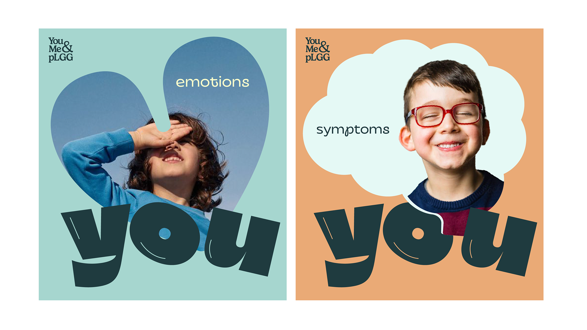
The design challenge was significant: create a visual identity that feels warm and approachable, even playful for younger patients, while respecting the gravity of the situation. It needed to work for a child flicking through a handbook and for a parent reading about treatment.
Above all, nothing could feel clinical, corporate, or cold.

You, Me & pLGG is a patient support programme created by Ipsen to inform, connect, and empower families living with paediatric low-grade glioma (pLGG). This noncancerous brain tumour that primarily affects children.
The brief was to build a complete visual identity from the ground up: name rationale, logo system, colour palette, typography, illustration style, tone of voice, and all key materials — a patient brochure, family handbook, and campaign guidelines.
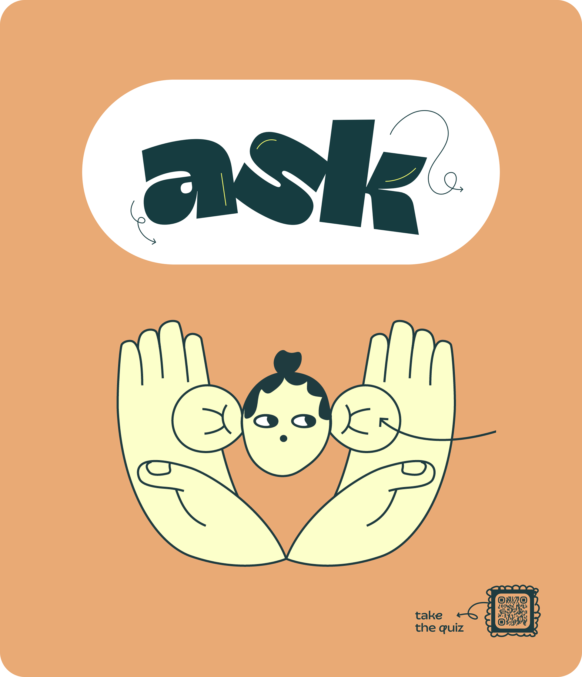
Finding the right &
Exploration
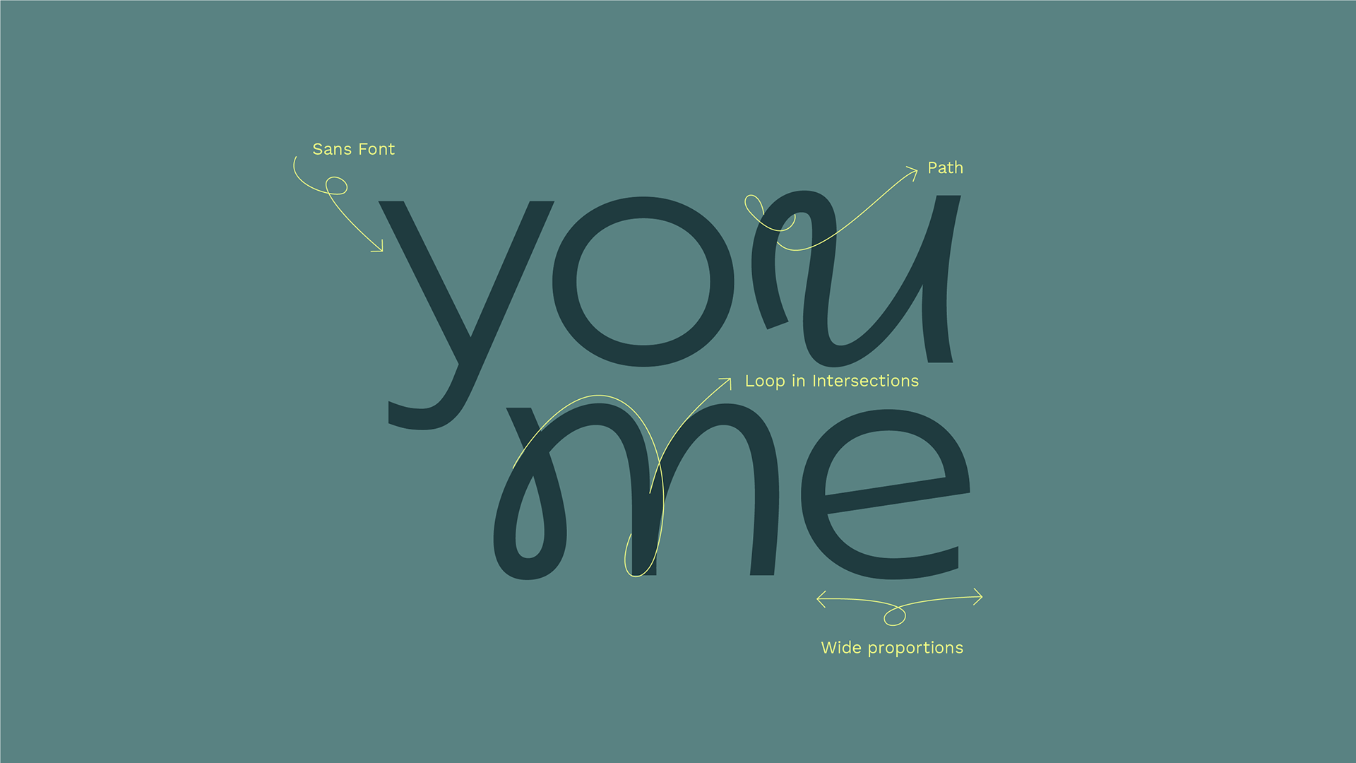
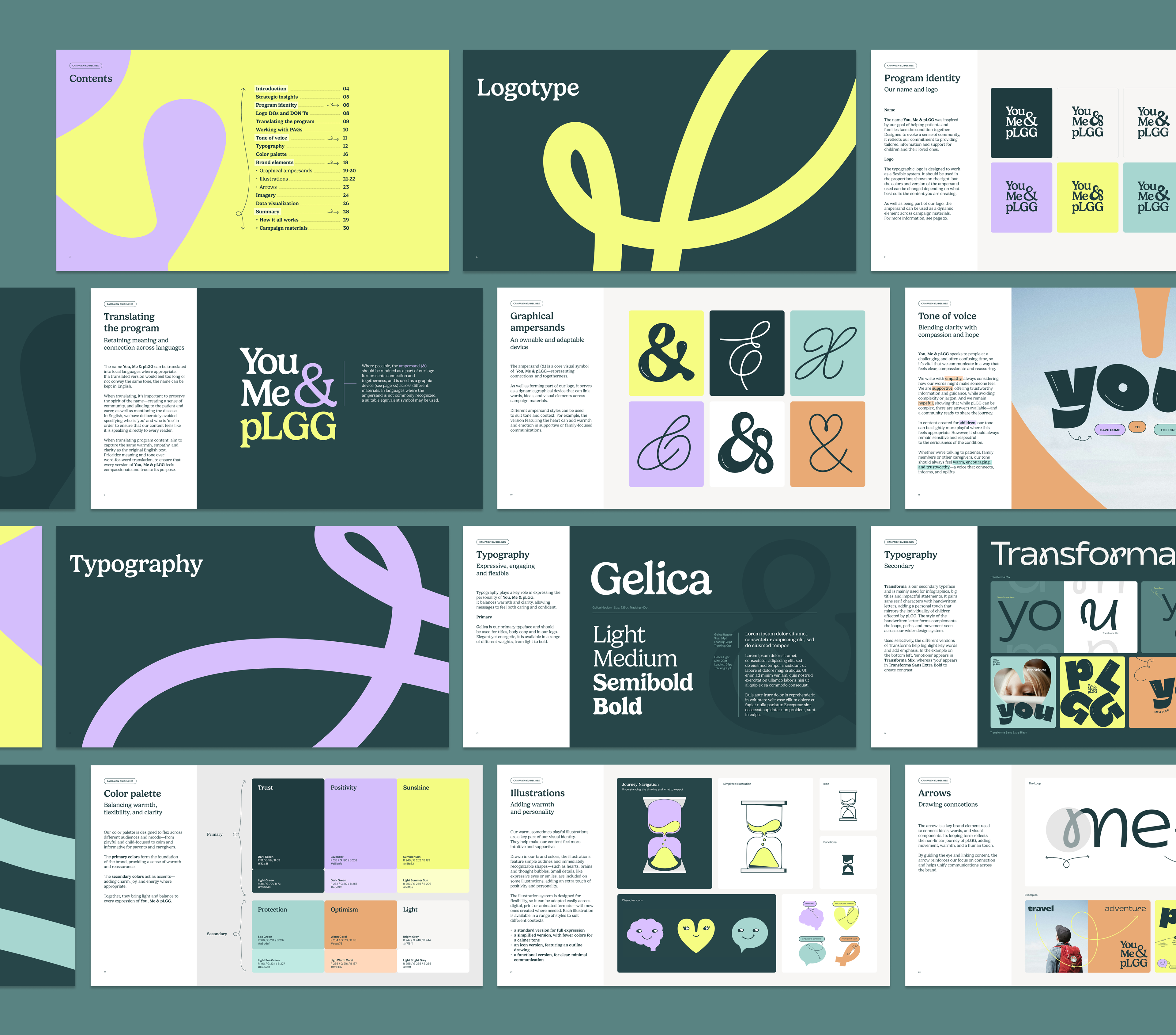
Extensive moodboarding drew from expressive editorial typography, fluid organic shapes, and bold graphic design to set the creative direction. The goal was a system that felt fresh, not medical.
Ampersand Study
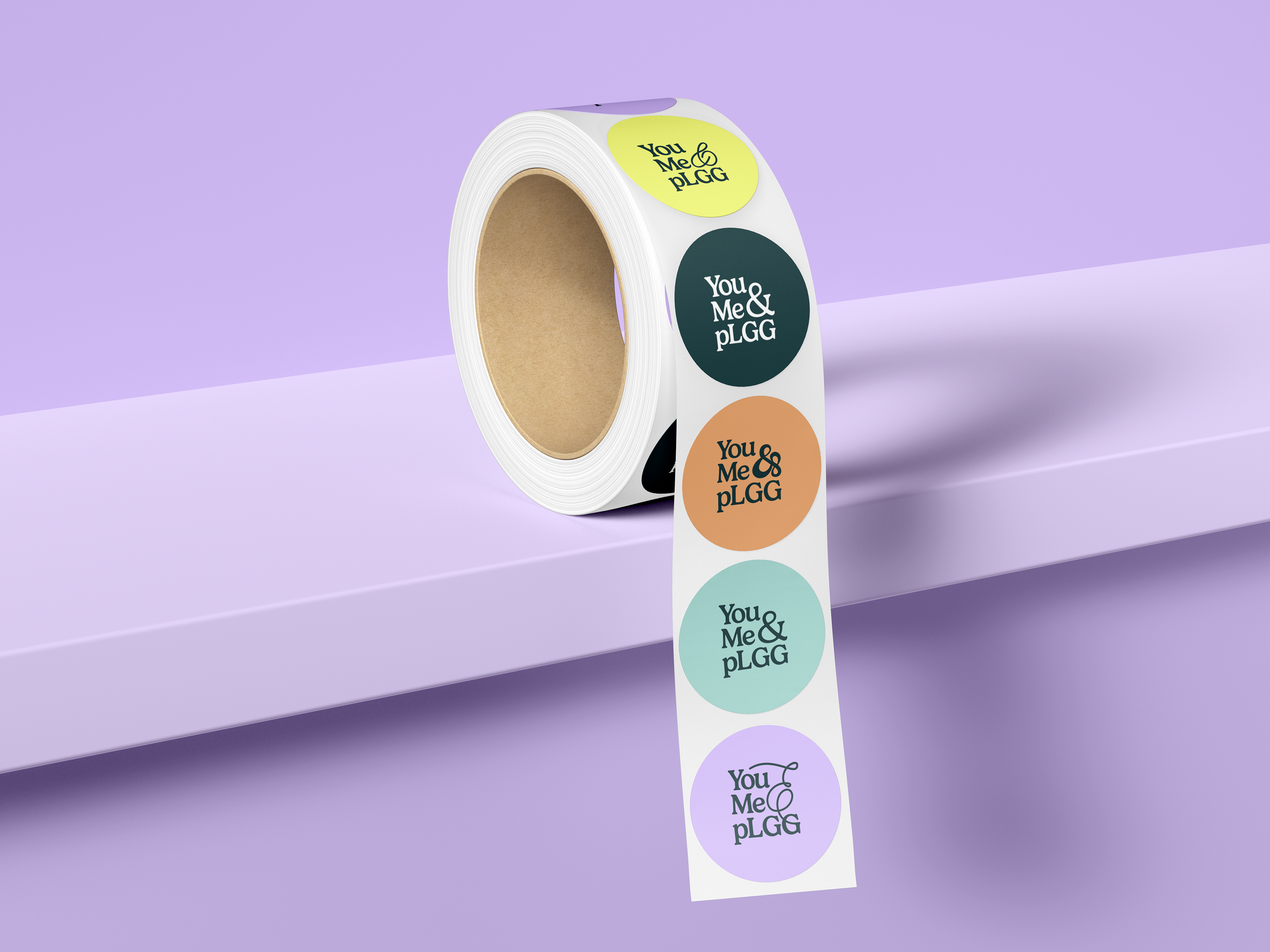
Dozens of ampersand forms were explored — from tight, structured serif styles to loose, handwritten scripts. Each carried a different emotional quality. The final system retained multiple styles for use across different contexts and tones.
Flexible System
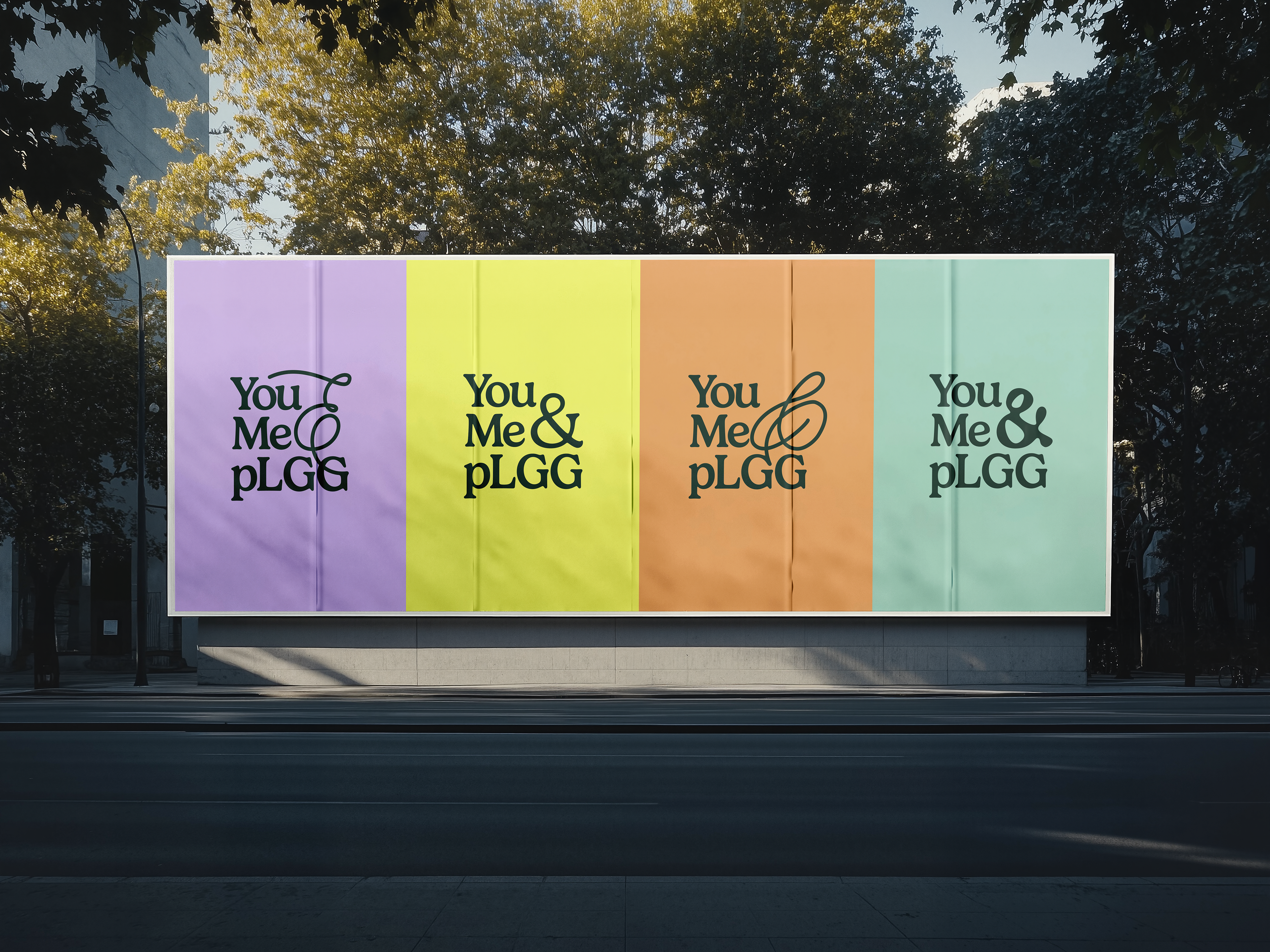
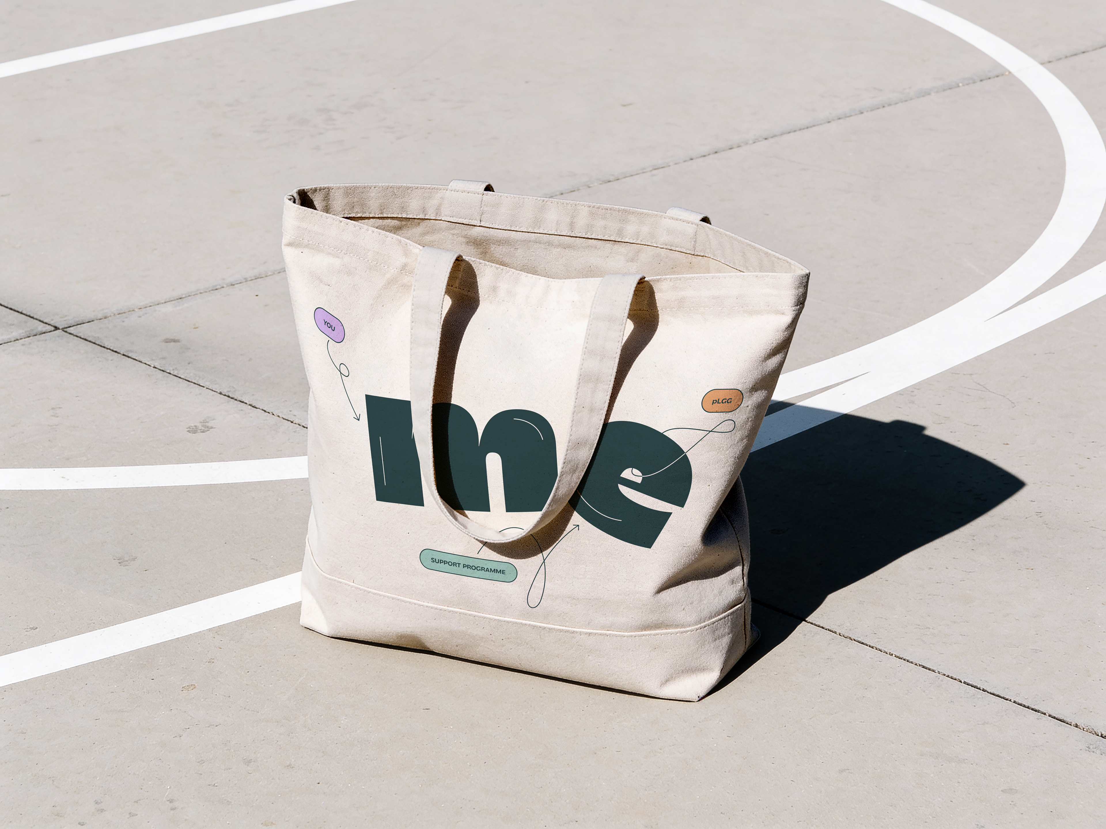
The typographic logo was designed as a flexible system rather than a fixed mark. Colours and ampersand styles can be swapped depending on content, audience, and mood — a rare feature that gives the brand genuine versatility.

Typography & tone
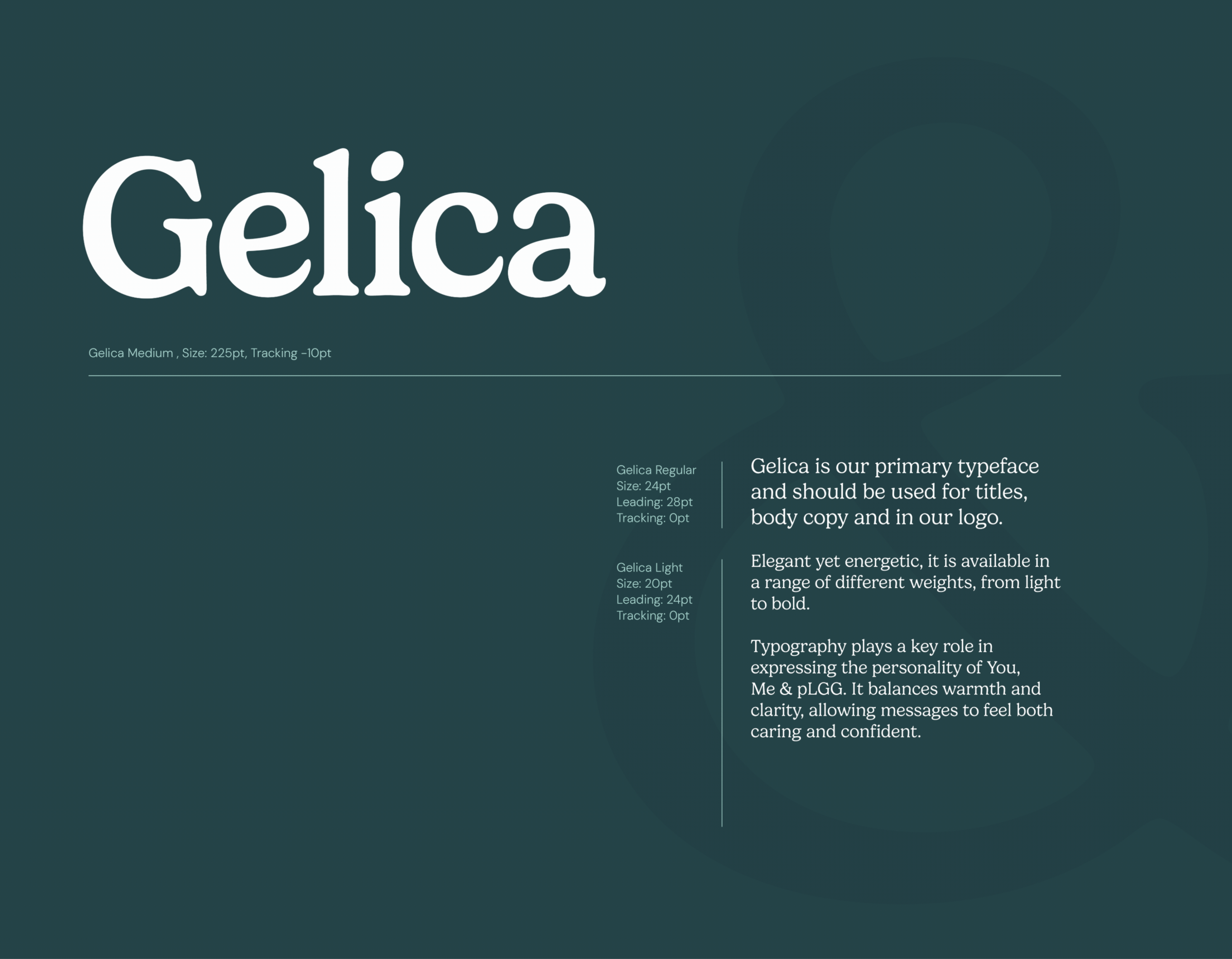
secondary typeface
Transforma is our secondary typeface and is mainly used for infographics, big titles and impactful statements. The style of the handwritten letter forms complements the loops, paths, and movement seen across our wider design system.
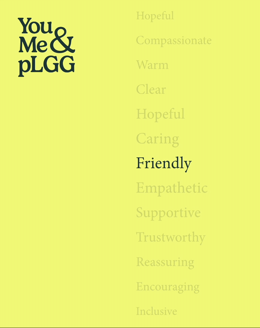
tone of voice


Colour Palette
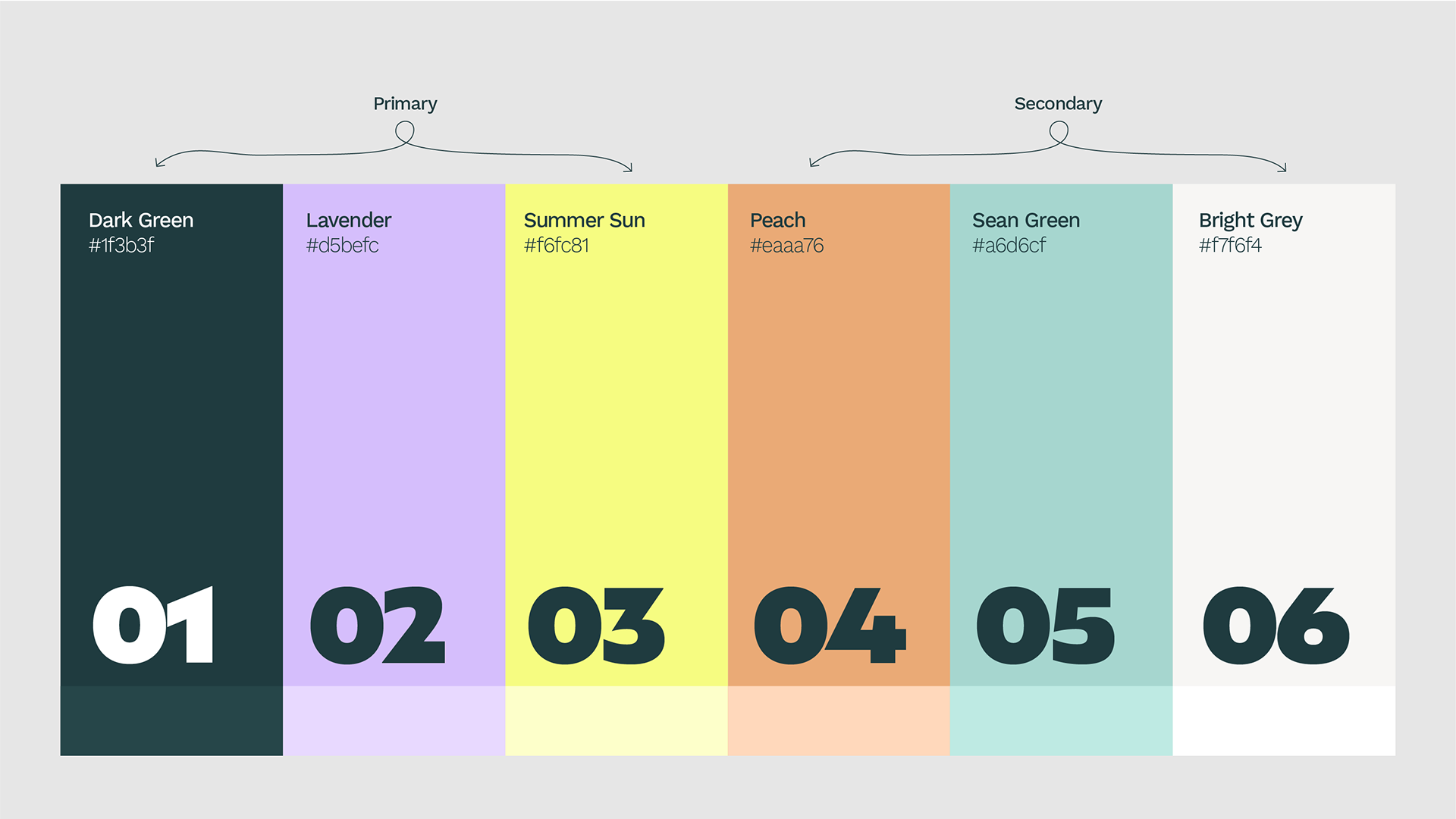
The palette flexes across audiences and moods — from playful and child-focused to calm and informative for parents. Primary colours provide foundation; secondary colours add joy and energy.

What was created
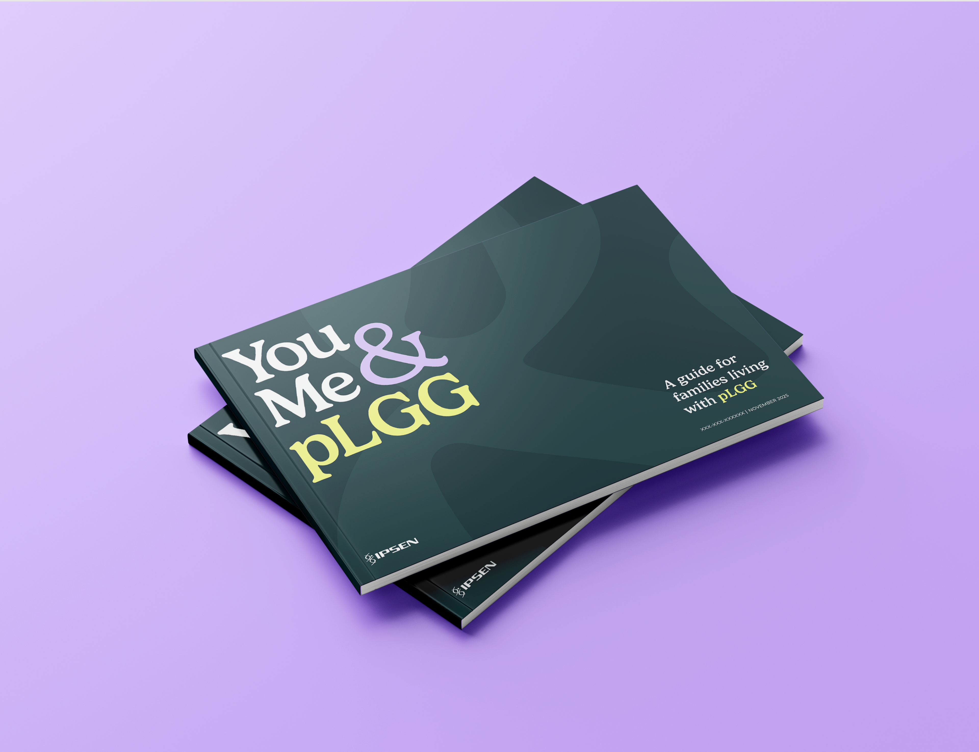
Brand Guidelines
A comprehensive 30-page brand guide covering identity, logo usage, typography, colour, illustration, imagery, tone of voice, and layout principles.
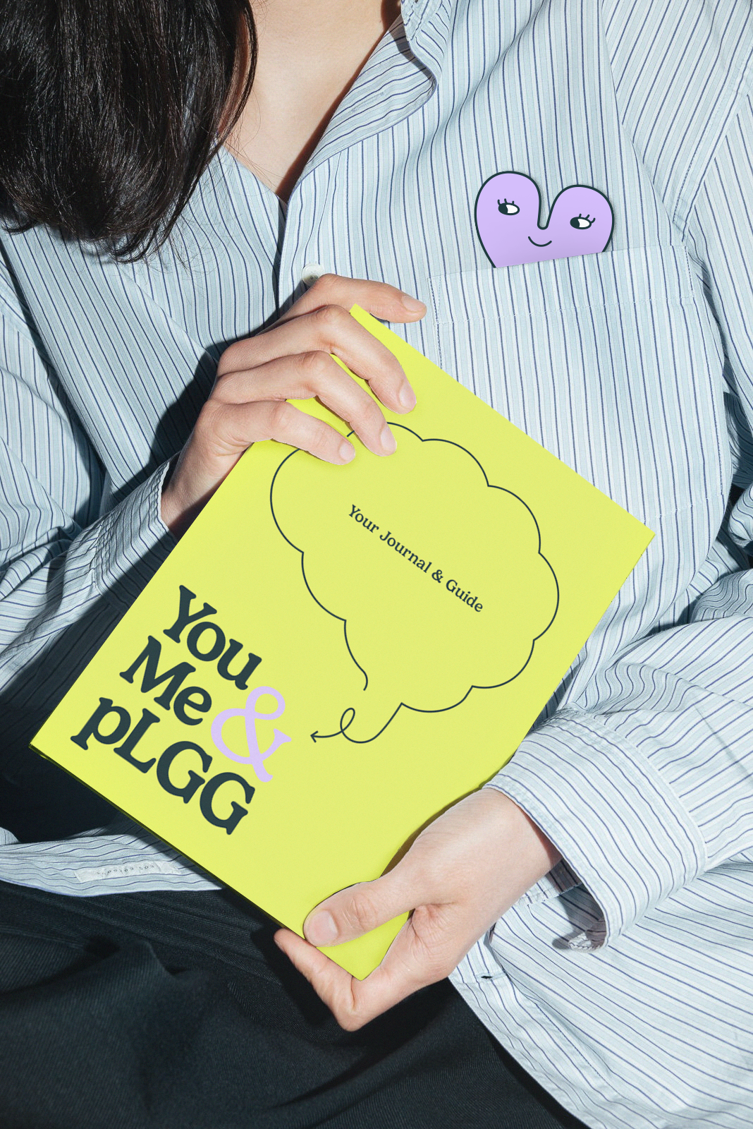
Patient Handbook
An interactive journal and guide for patients and their families — with goal setting, appointment trackers, glossaries, and space for personal notes.
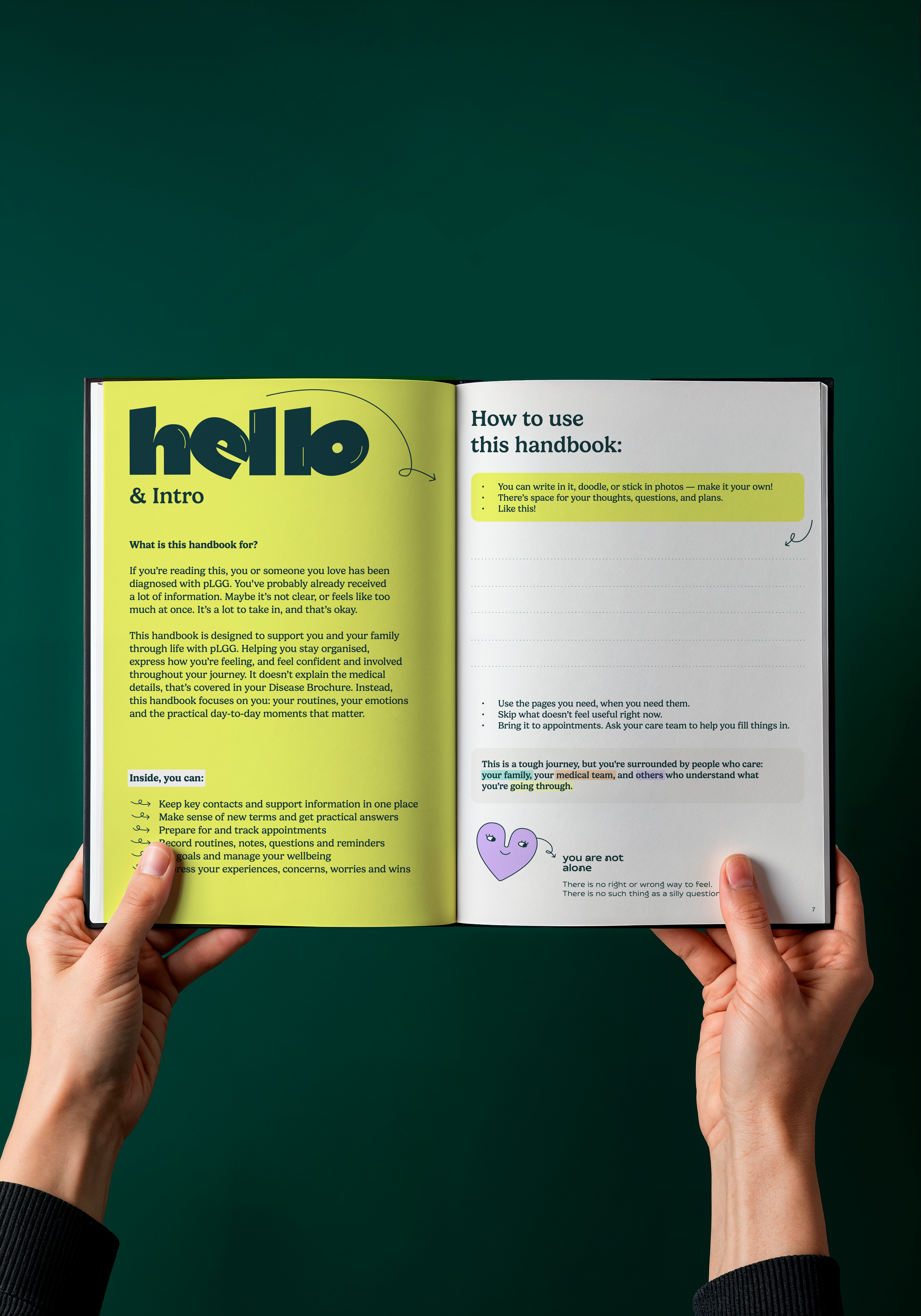
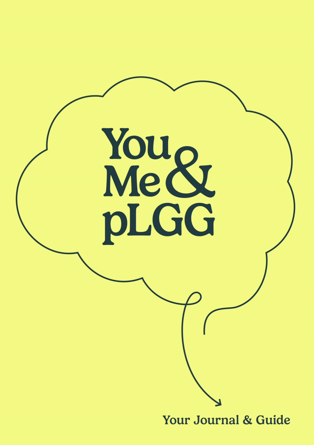
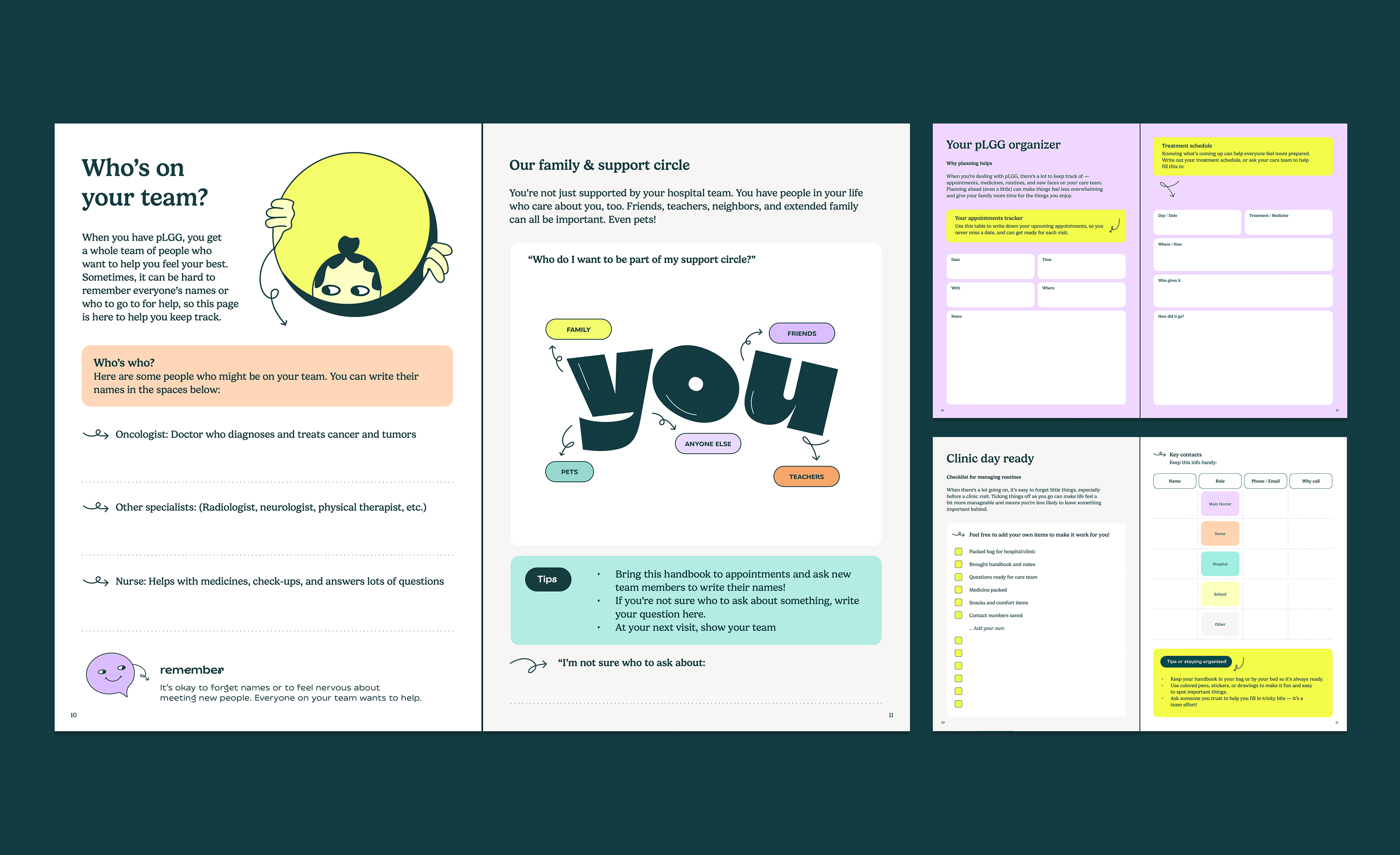
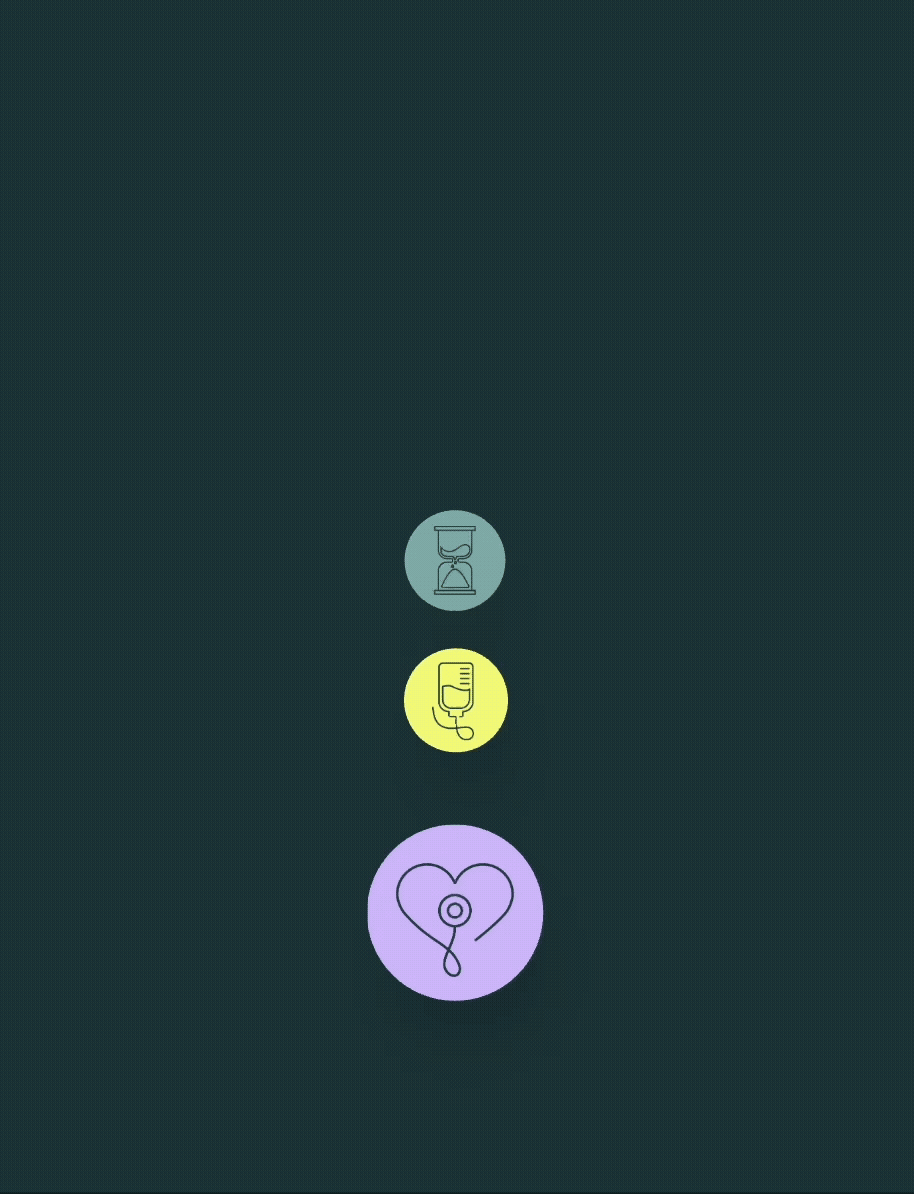
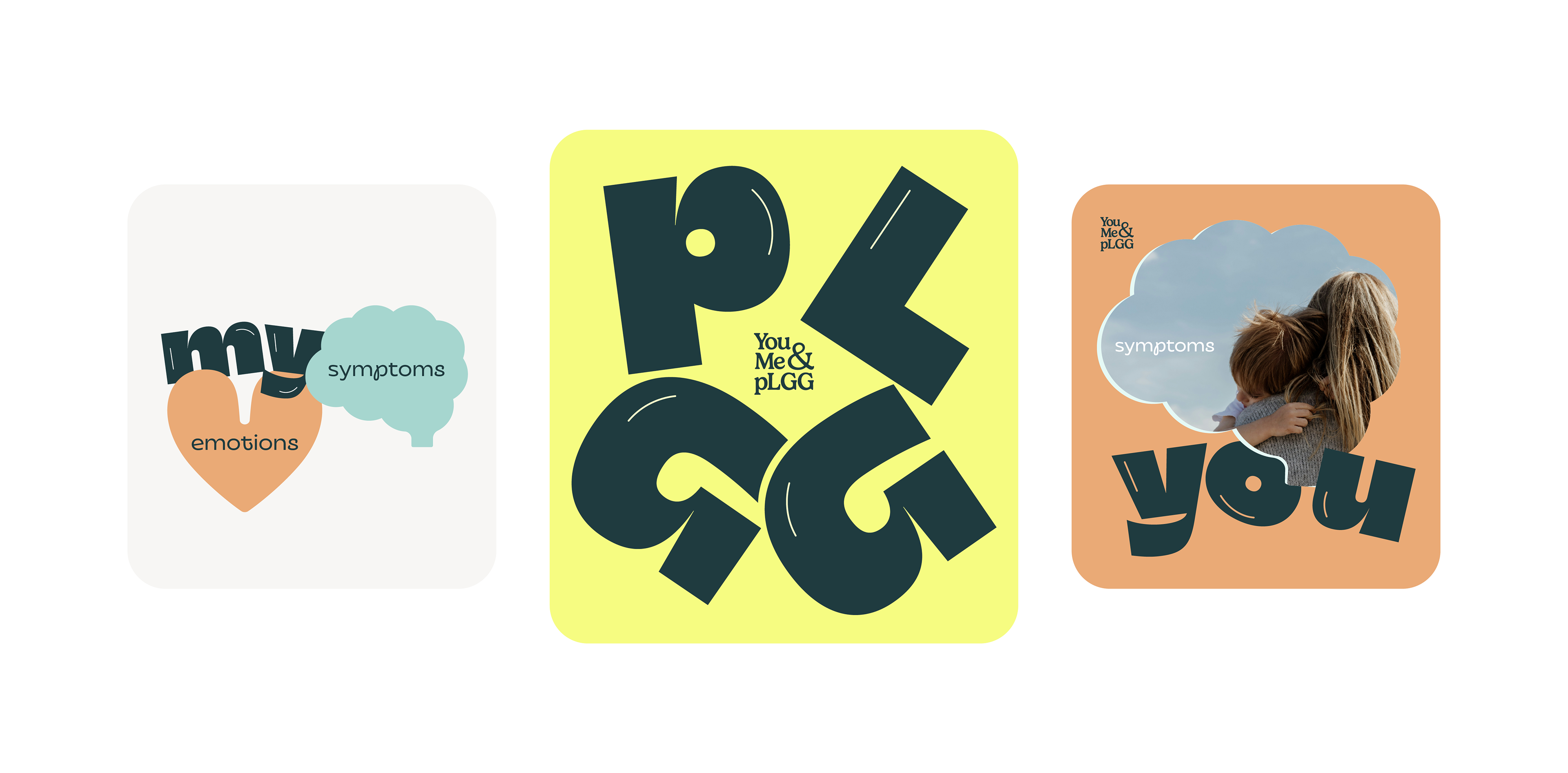
Illustration System
A bespoke illustration library featuring character icons, journey navigation visuals, and icon-image cropping masks — available in standard, simplified, icon, and functional styles.