

AGENCY: RANCH CREATIVE
ART DIRECTION / BRAND IDENTITY / WEB DESIGN / 2025
RANCH
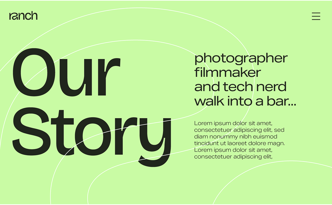
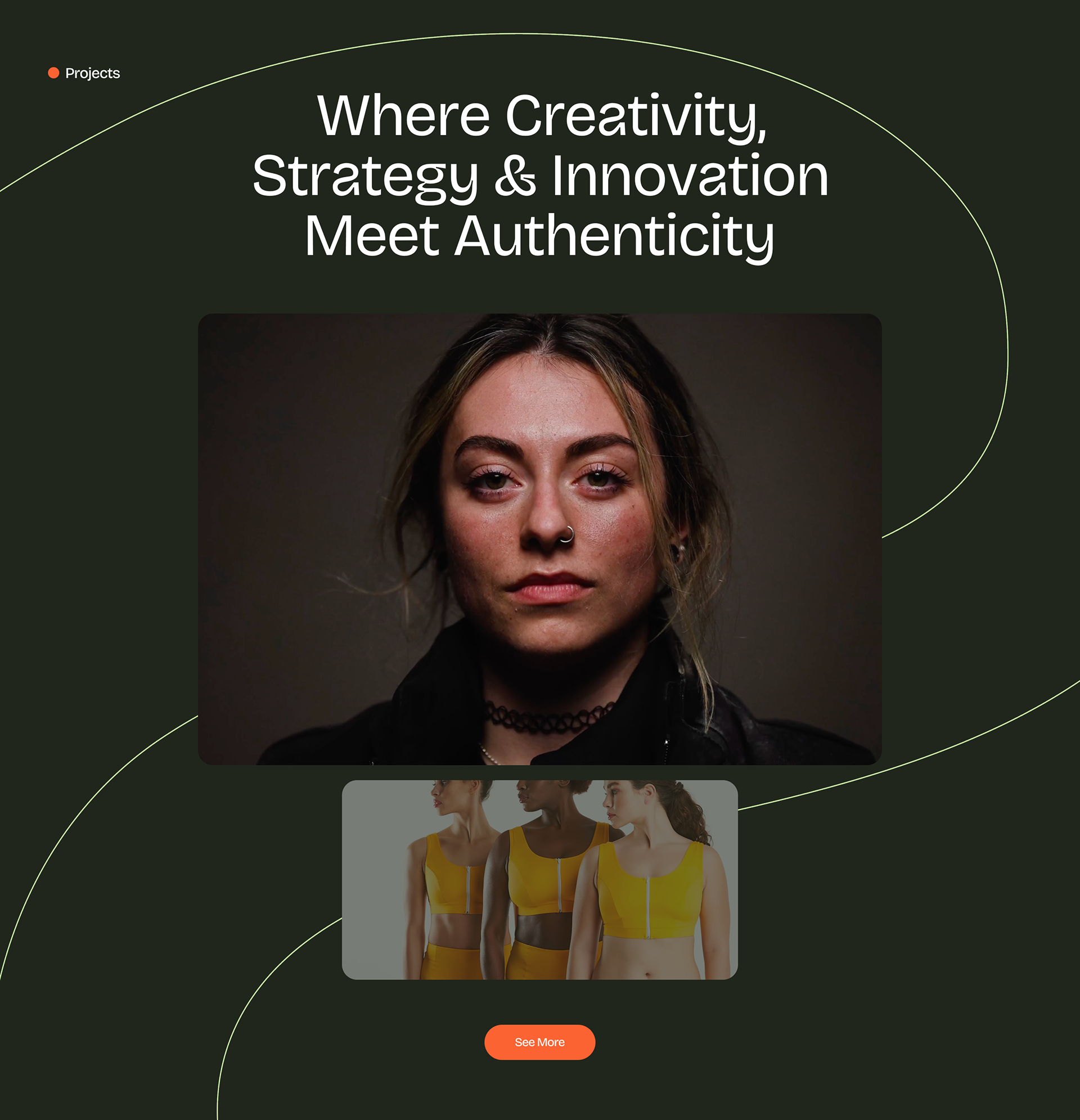
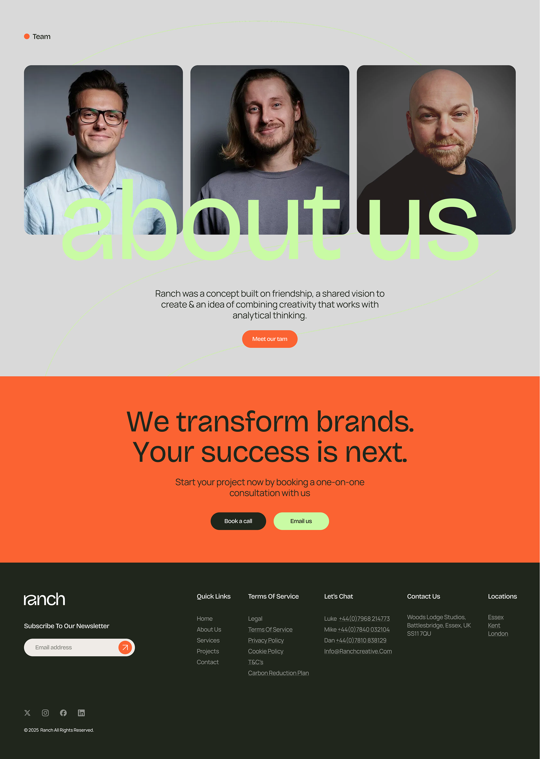
Ranch is a creative agency working across production, studio, audio, and photography services. They came to me with a brand that had outgrown itself: a bold, industrial wordmark that no longer reflected the range and sophistication of the work they were producing.
The brief was a full rebrand, identity, typography, sub-brand architecture, and a new website to bring it all to life.
DELIVERABLES:
LOGO, VISUAL SYSTEM, COMPLETE BRAND GUIDELINES (PDF + FIGMA), MOTION ASSETS, WEBSITE TEMPLATE CREATED IN FIGMA AND FRAMER

Where I started
The old mark was a stacked, all-caps wordmark in yellow on black — confident, but one-note. It didn't flex well across Ranch's different services (Studio, Production, Audio, Photography), and there was no real system behind it: no secondary mark, no colour logic, no typographic hierarchy. The goal wasn't to lose that confidence, just to give it more range.
Finding the direction
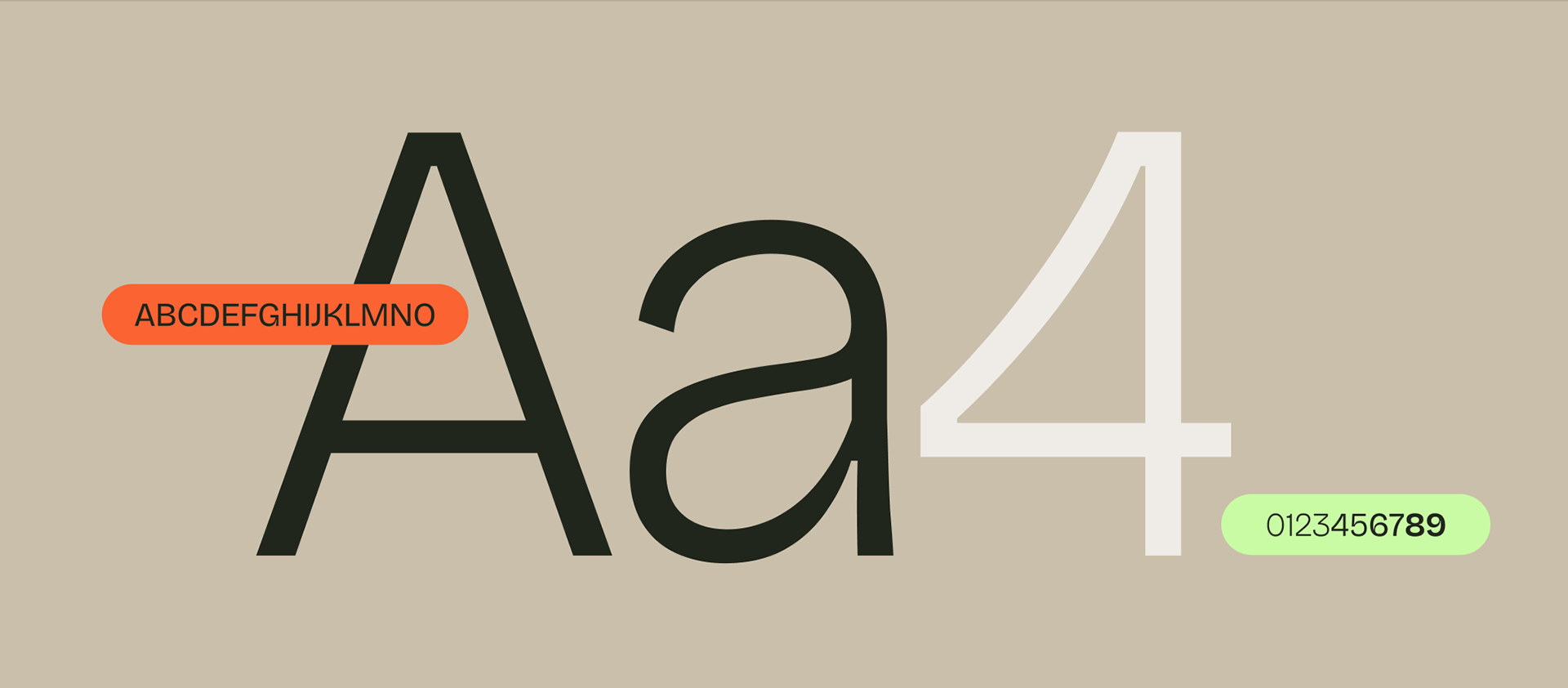
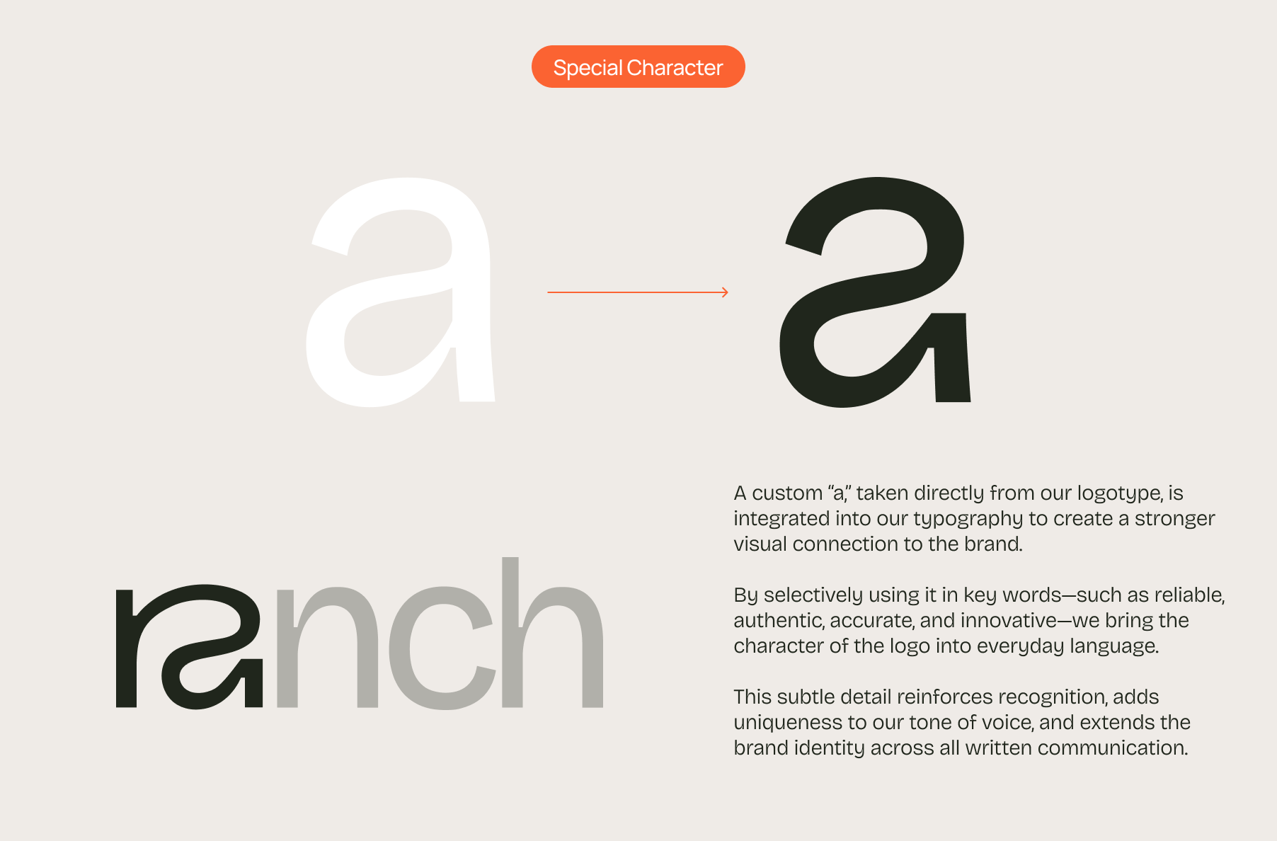
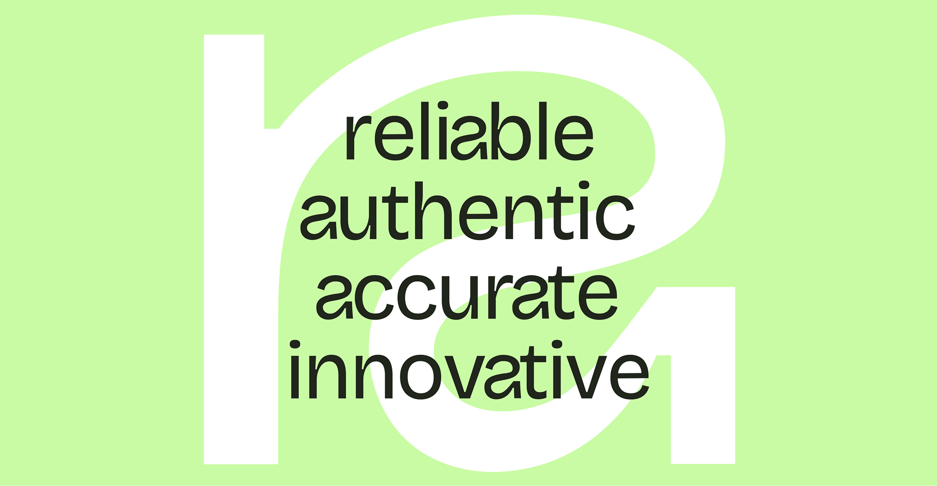
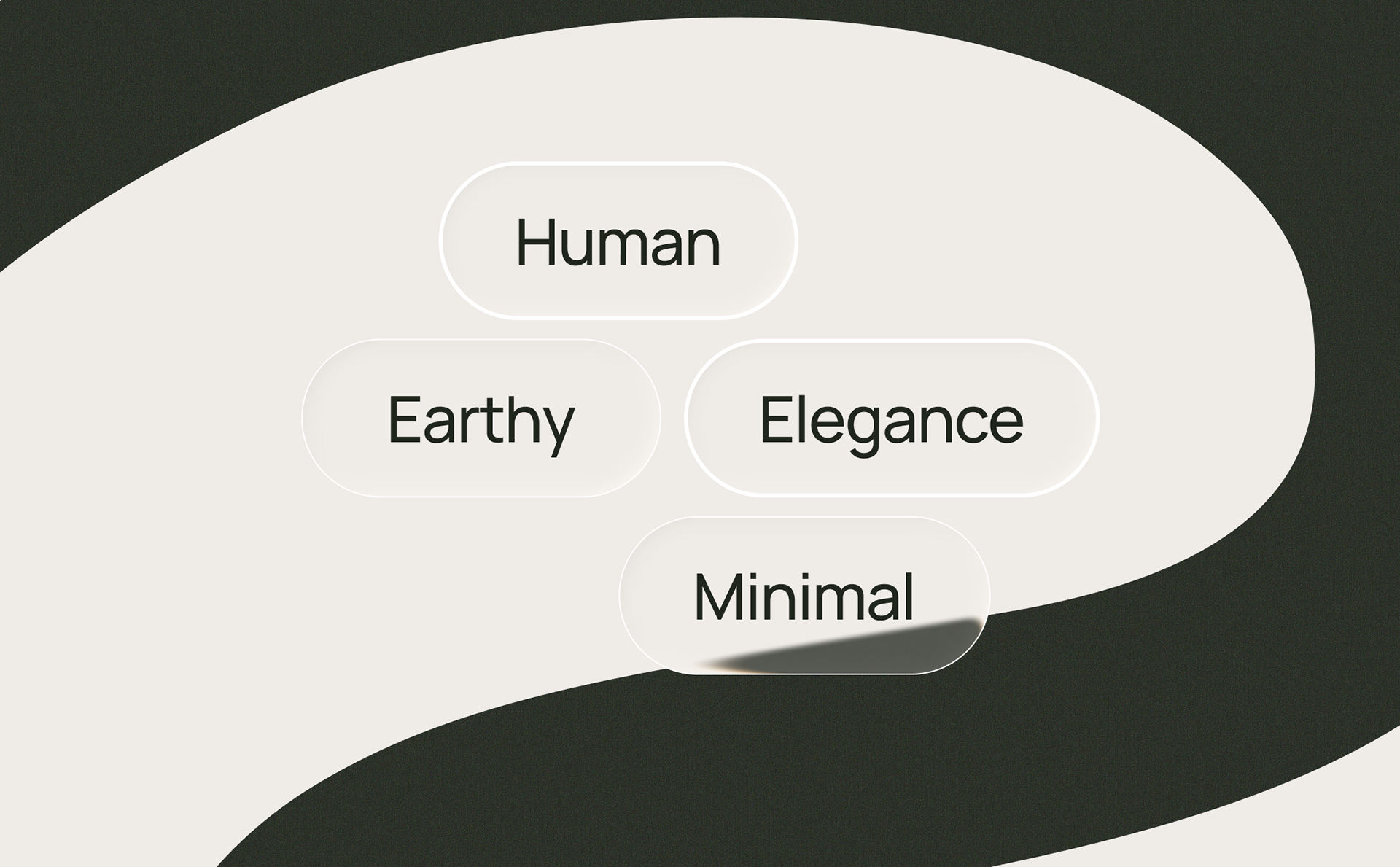
After a few creative routes, one stuck: a balance of human warmth and modern sophistication, built on natural tones, clean type, and understated layouts. Four words anchored it — Human, Earthy, Elegance, Minimal — which shaped a brand personality of: Reliable, Authentic, Accurate, and Innovative.
I wrote Ranch's vision, mission, and promise straight from those words, so the personality shows up in how the brand actually talks, not just how it looks.
The logomark
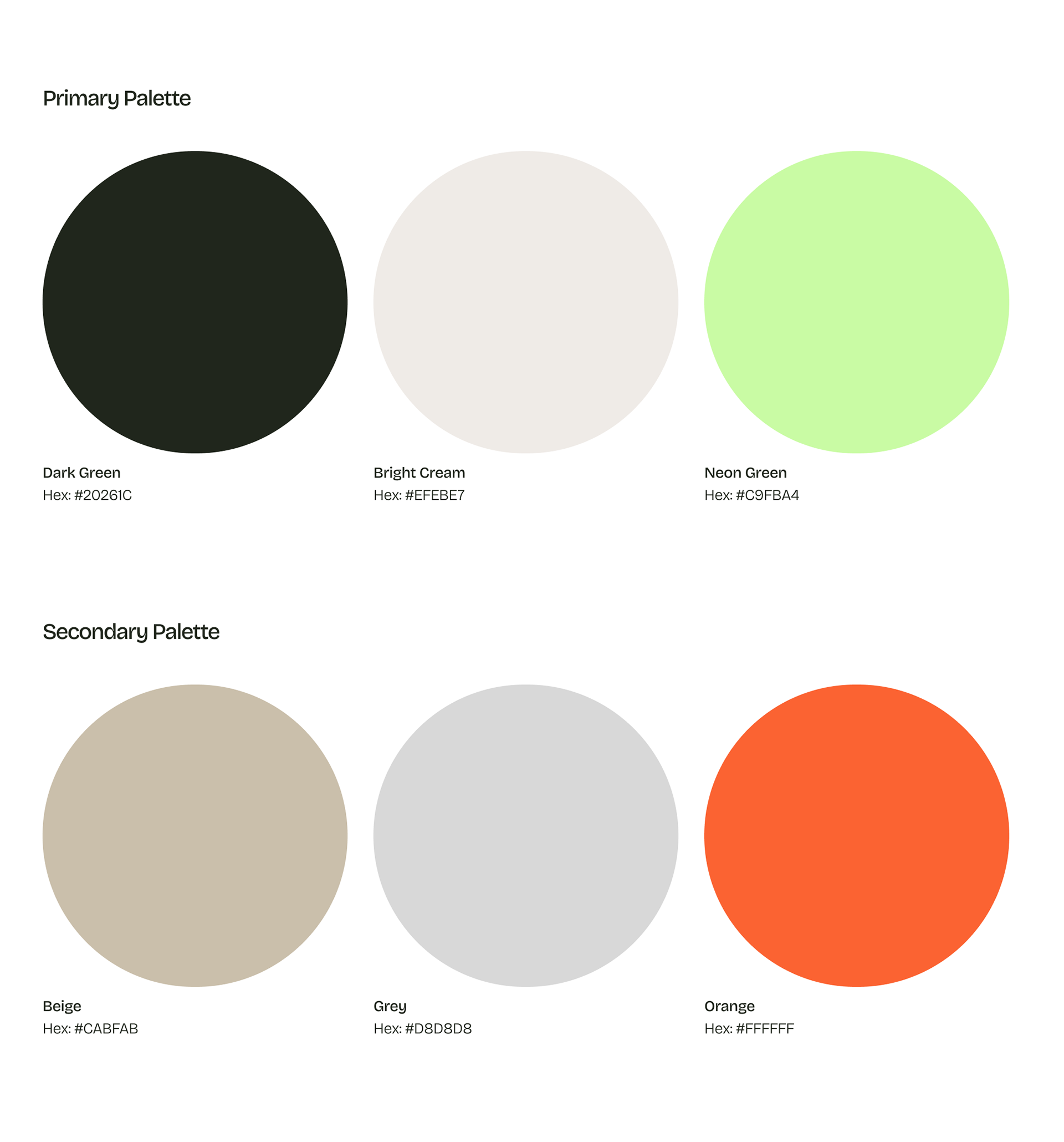
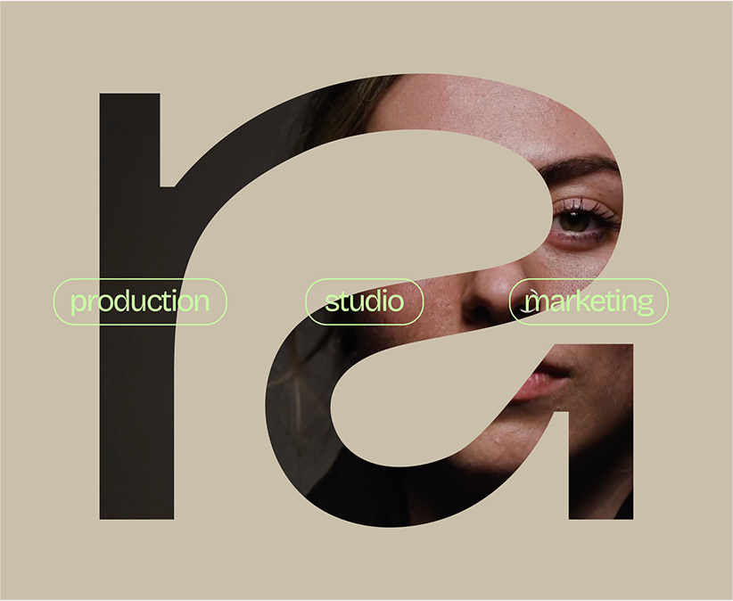
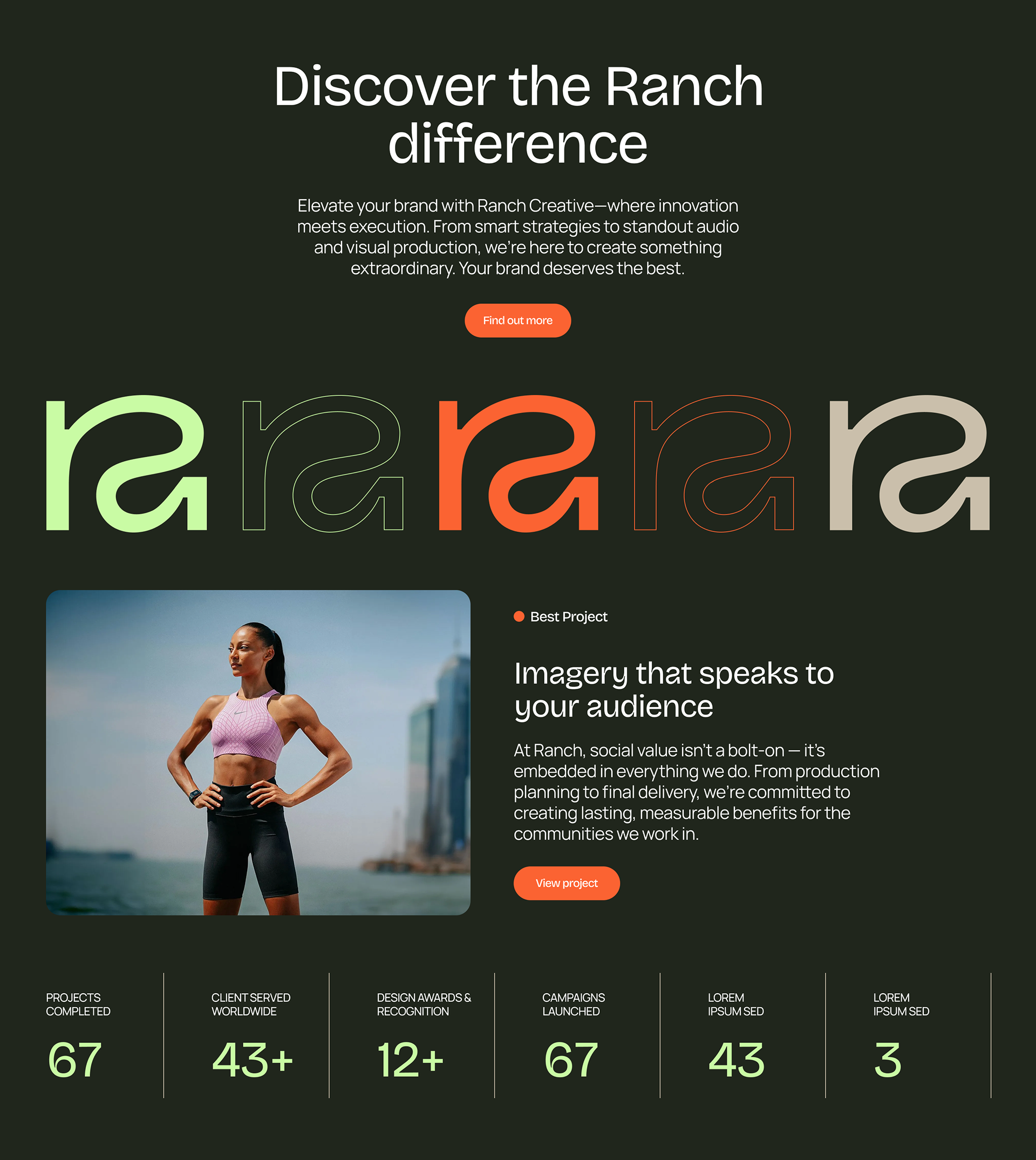
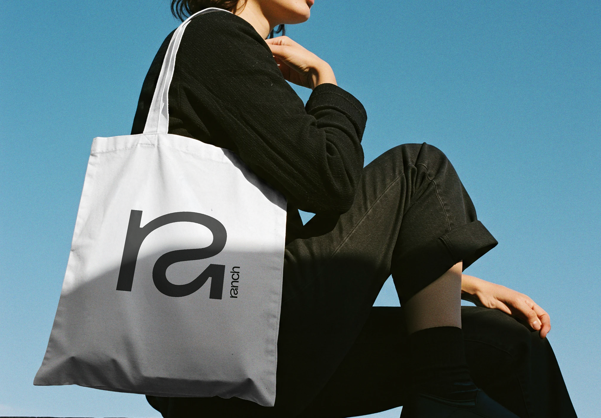
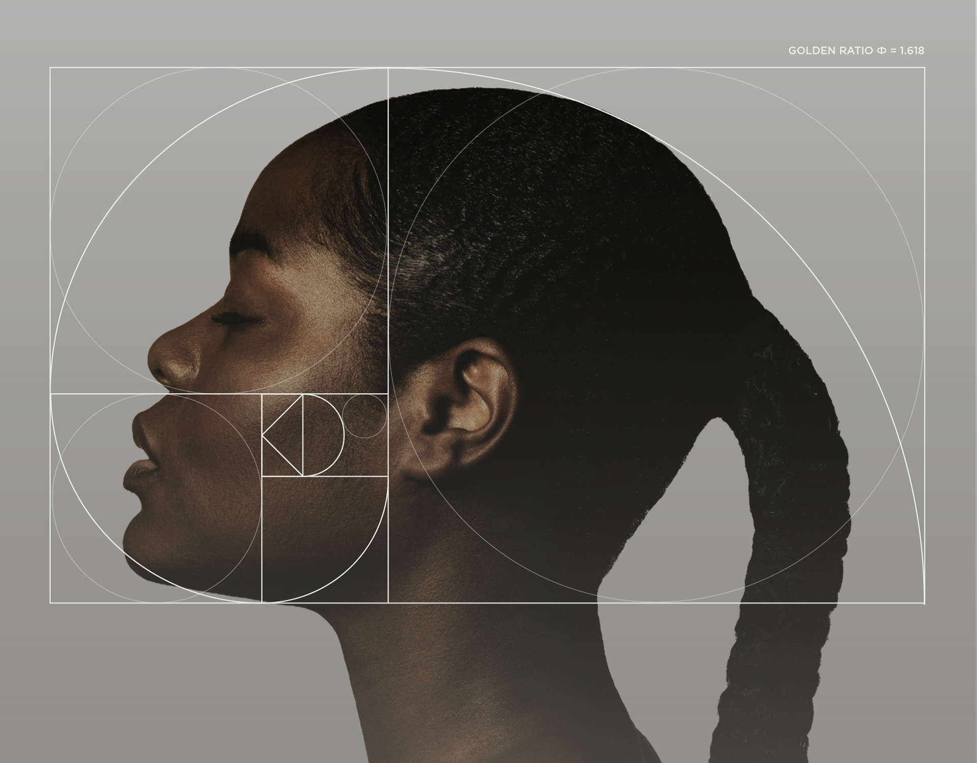
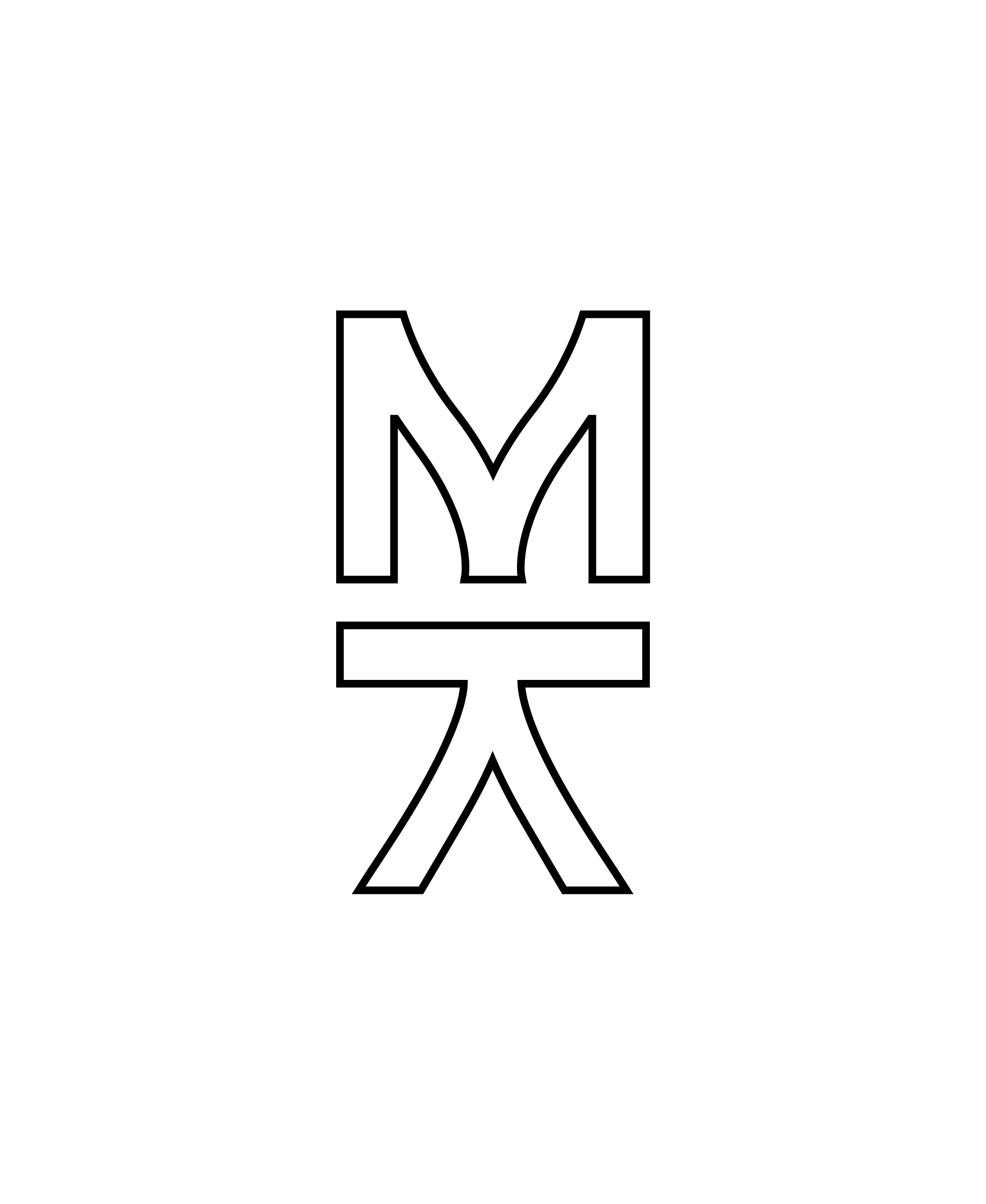
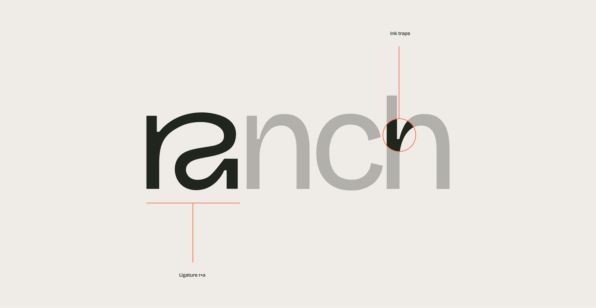
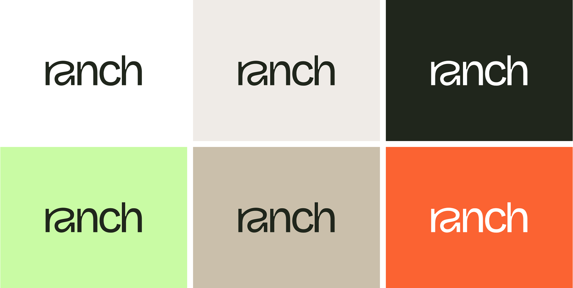
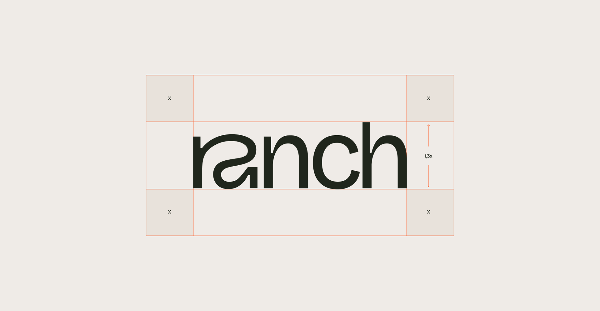
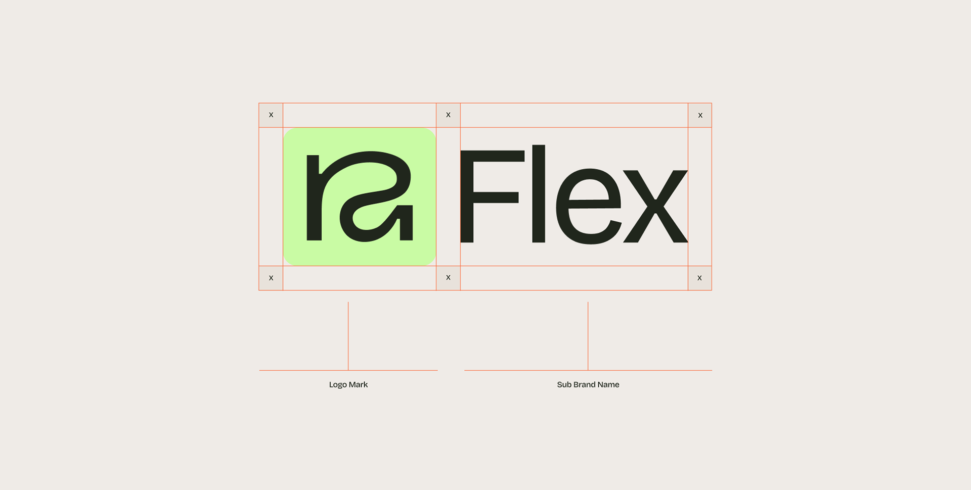
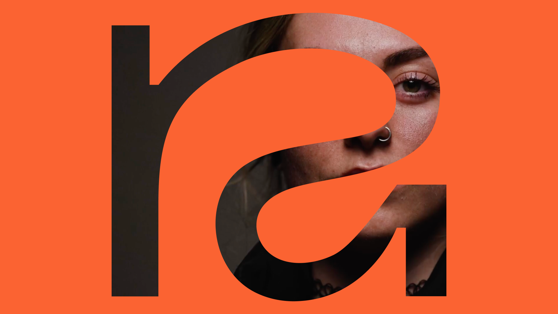
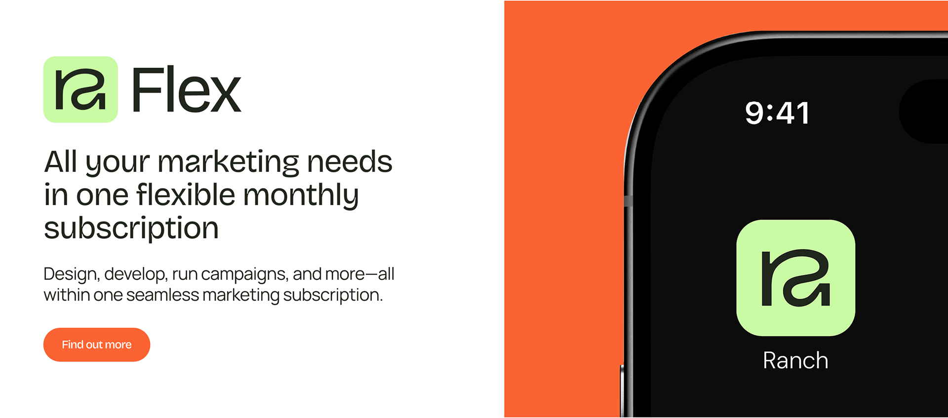
The centerpiece is a custom mark that fuses "r" and "a" into one continuous symbol — bold, modern, and legible at any size. It's built to flex: the letters can pull apart into standalone graphic elements, or scale up as pure texture. A construction grid and a set of approved colours (ink, lime green, taupe, orange) keep it consistent everywhere, from a tote bag to an app icon.
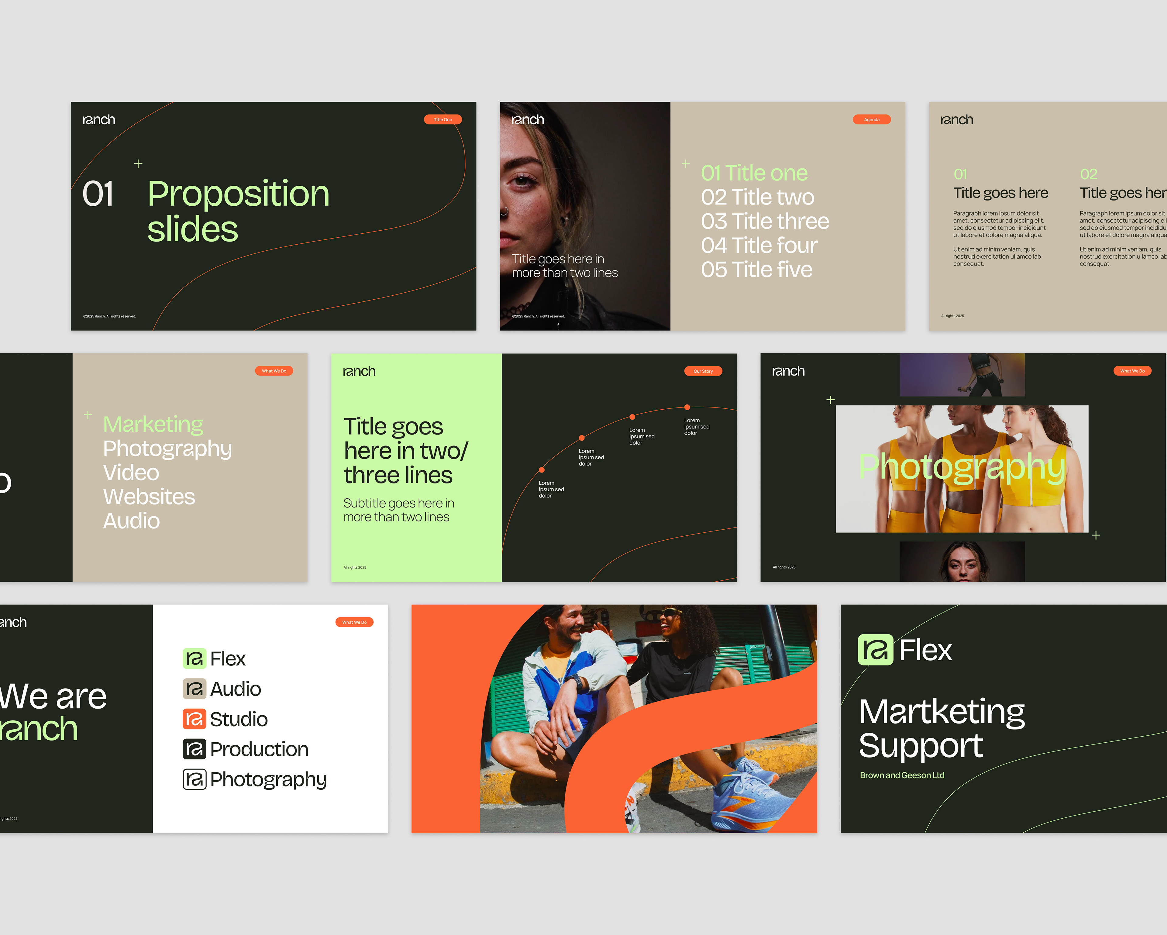
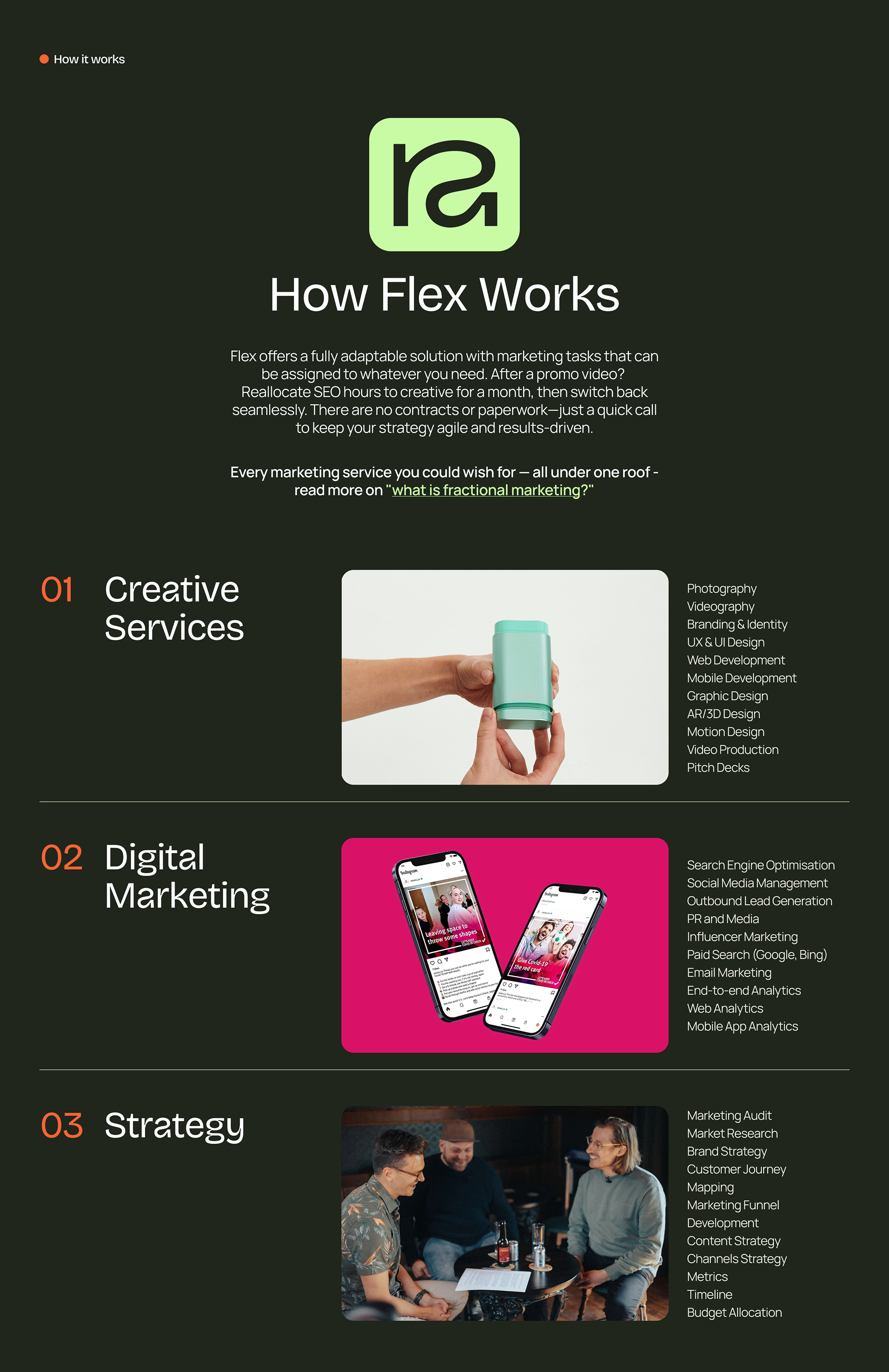
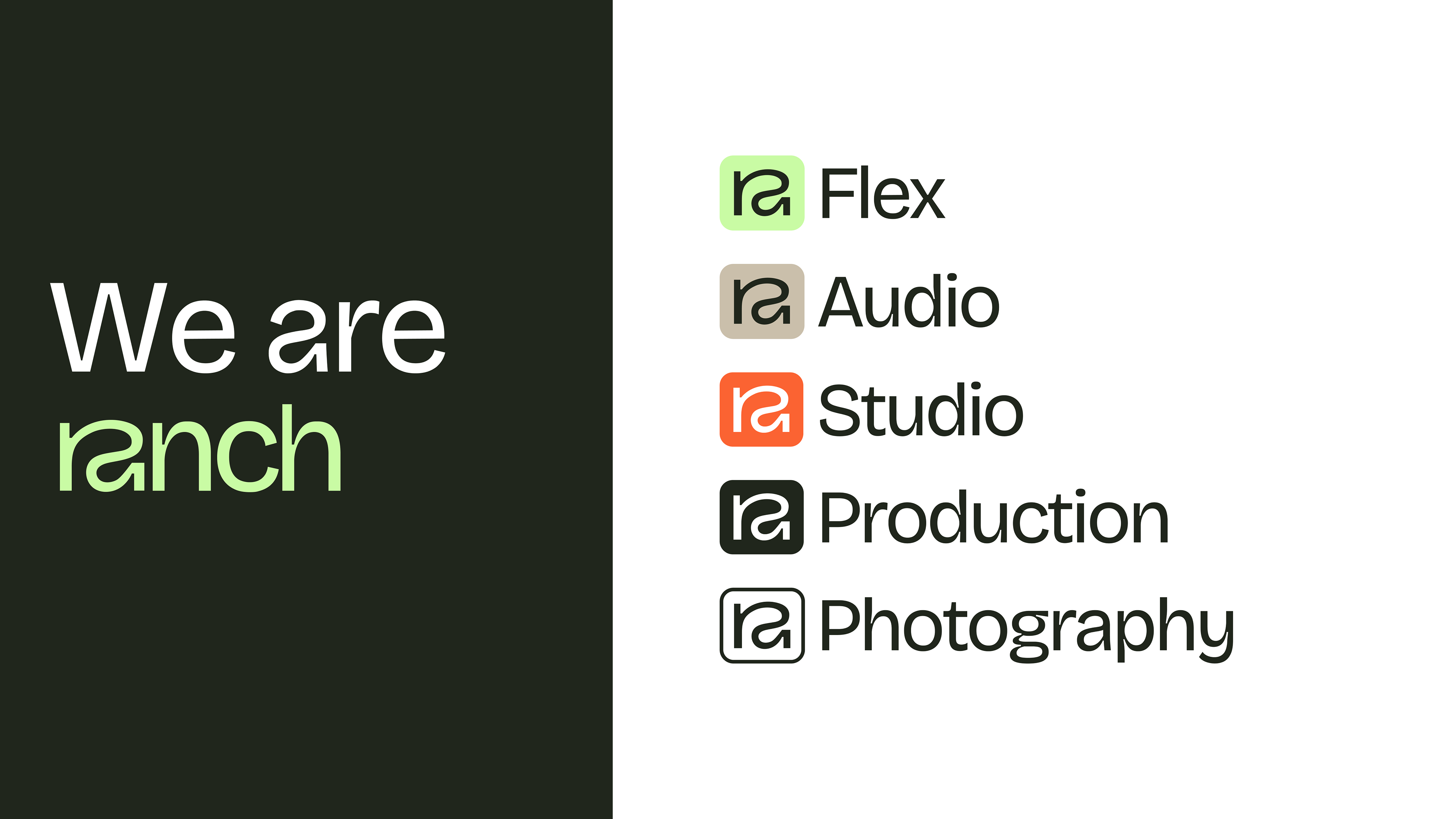
That same mark also became the backbone of a sub-brand system — pairing with a wordmark suffix to generate Flex, Studio, Production, Audio, and Photography, each colour-coded but built off one shared lockup.
Ranch can now spin up a new service line without designing a new identity from scratch.


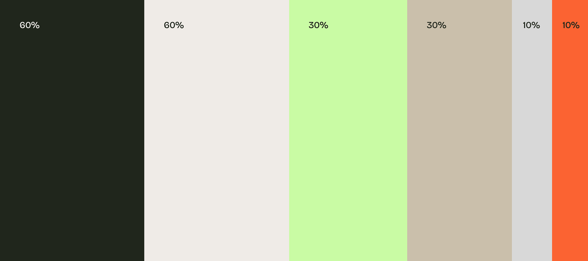
The Colour Palette
Proportion of colour usage - 60-30-10