

AGENCY: BBH LONDON
BRAND IDENTITY / ART DIRECTION / 2019
DAXXIFY
Building a botulinum toxin brand for Revance around a single natural constant - the golden ratio, from the letterform up to the launch campaign.
PROJECT CREDITS:
AGENCY: BBH LONDON; CREATIVE DIRECTOR: PAUL FOSTER; AGGIE BIL, BRADLEY GODOLPHIN; HEAD OF HEALTH: NATALIE ENNIKS; STRATEGY DIRECTOR: FRANKIE EVERSON
DELIVERABLES:
LOGO, BRAND GUIDELINES , MOTION DESIGN
A precision toxin needed a precision brand
Daxxify is a next-generation neuromodulator designed for longer-lasting results. My brief at BBH London was to build a confident visual language around that core promise—one that scaled seamlessly across derm clinics, billboards, and pitch decks.
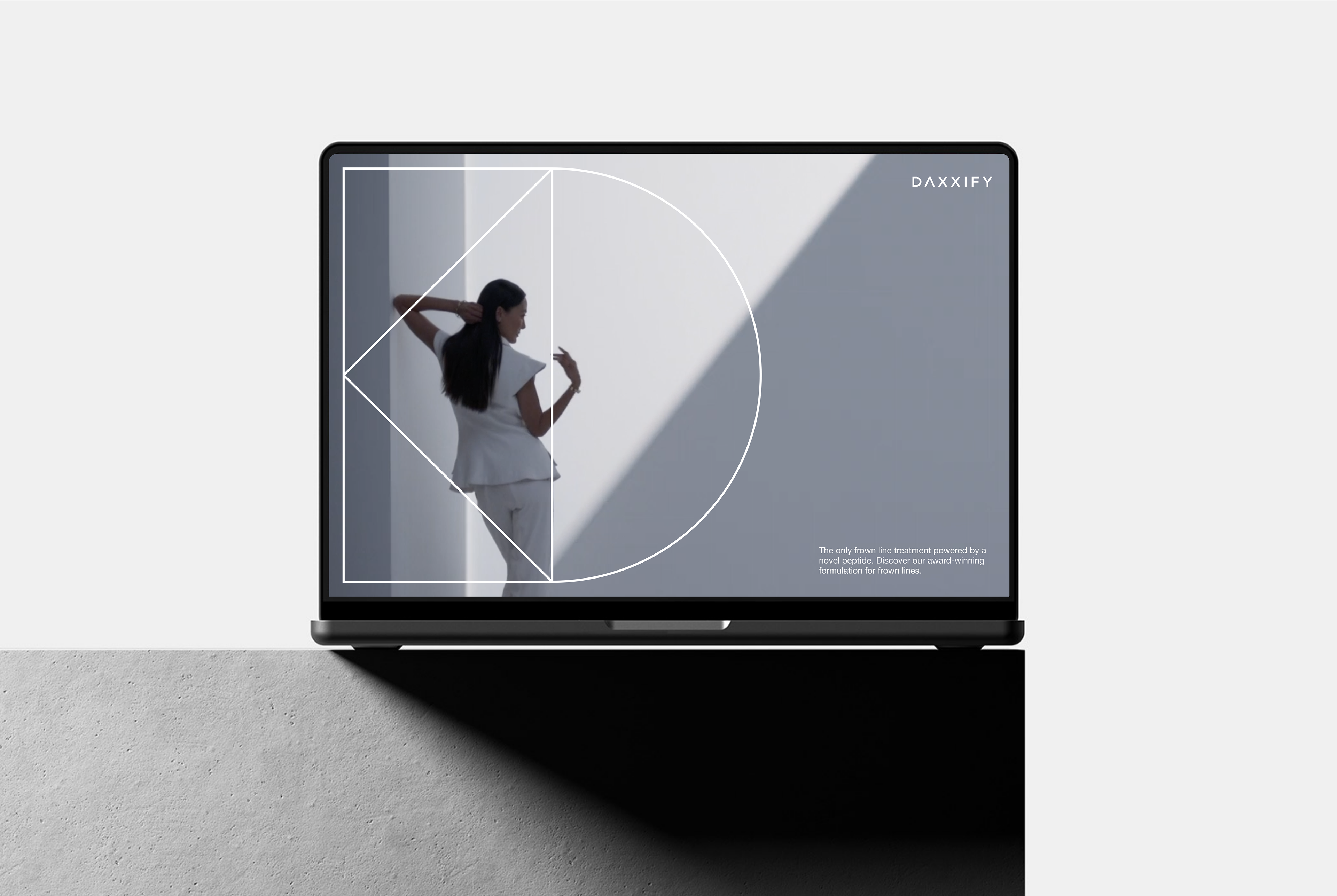
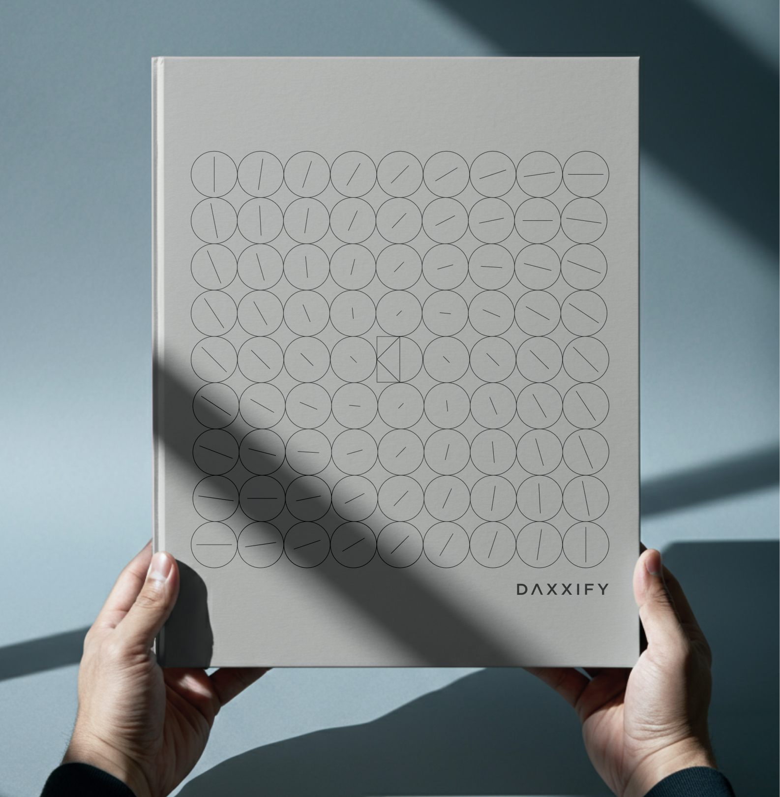
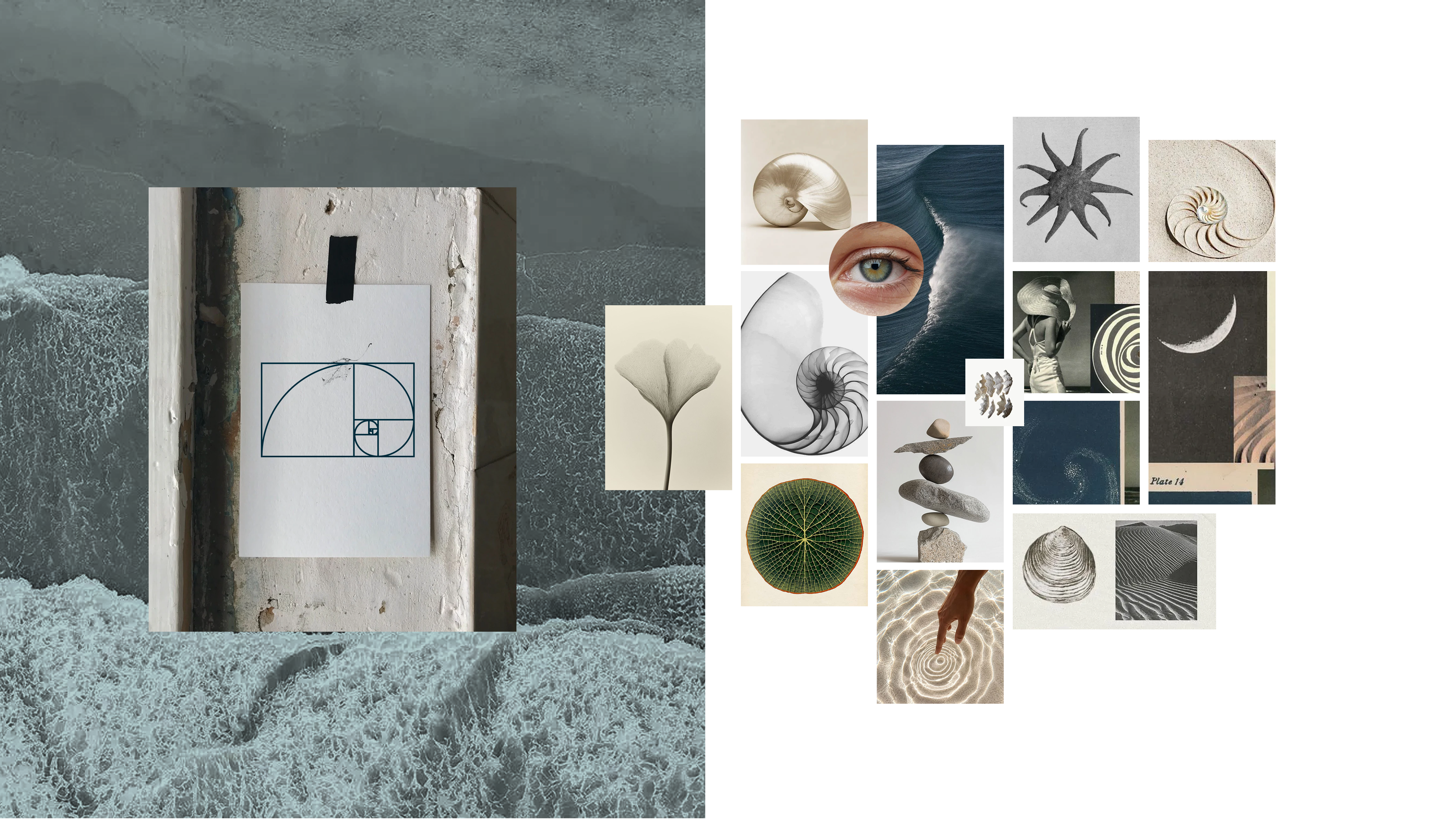
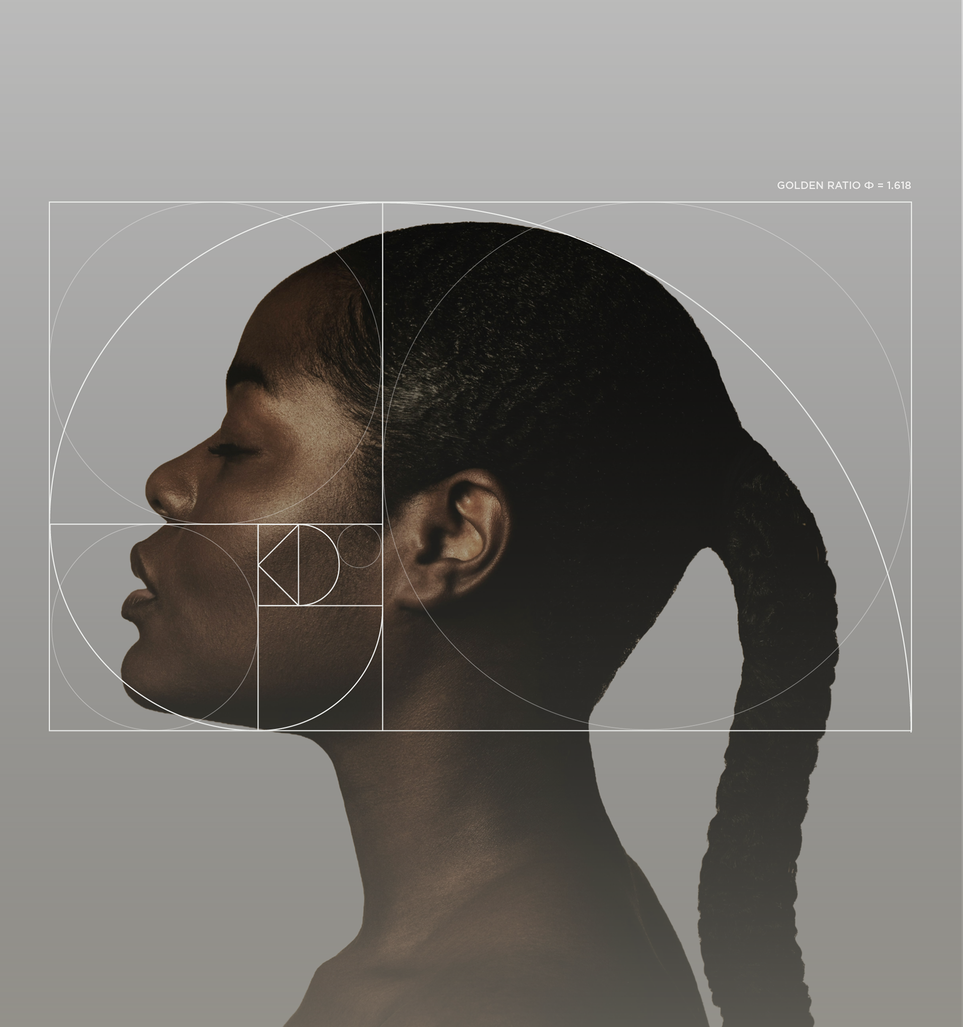
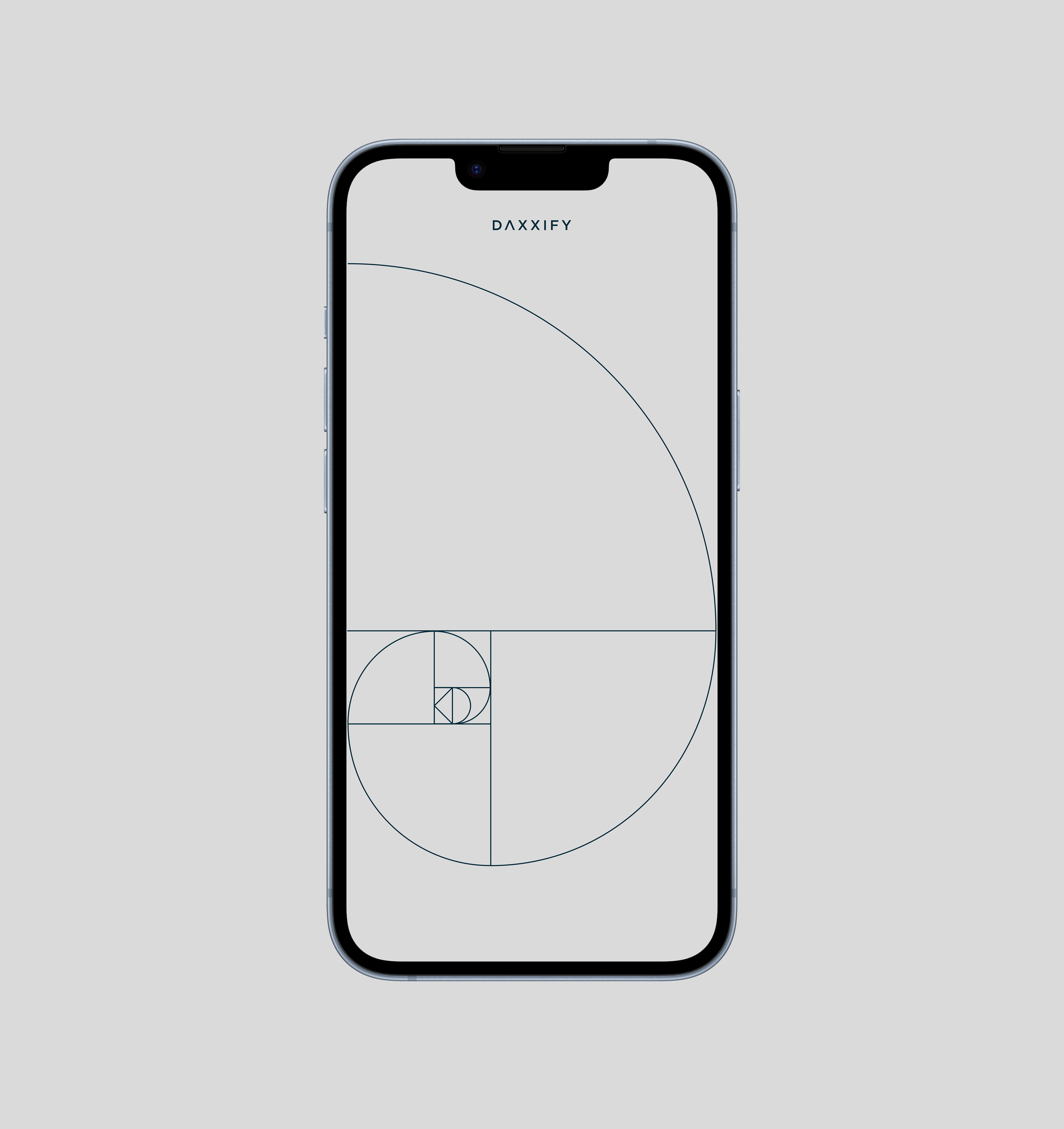
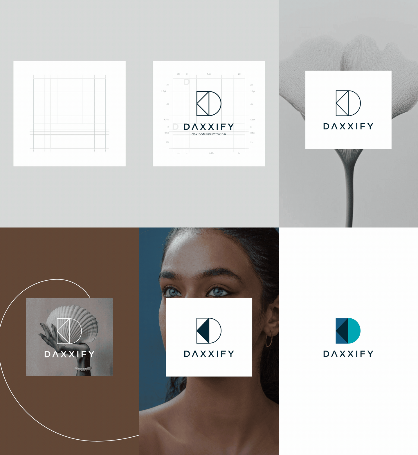
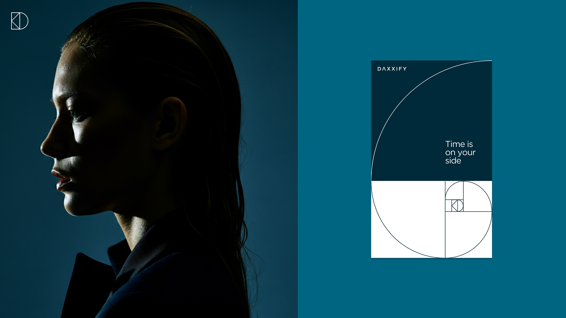
So instead of starting with a face, I started with a formula: the golden ratio φ = 1.618 , the proportion nature uses to build shells, waves, and the human face. That single ratio became the design constraint for everything that followed, shaping the wordmark, guiding every grid layout, and creating a recurring spiral that served as the campaign’s quiet signature.
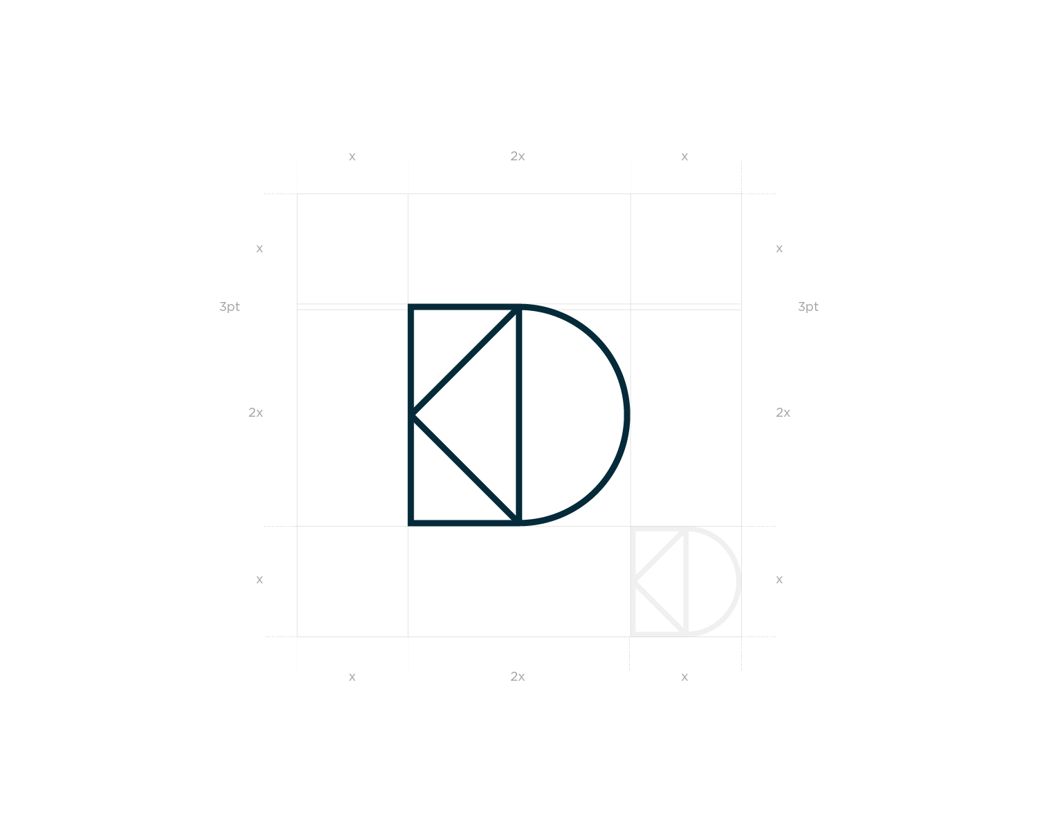
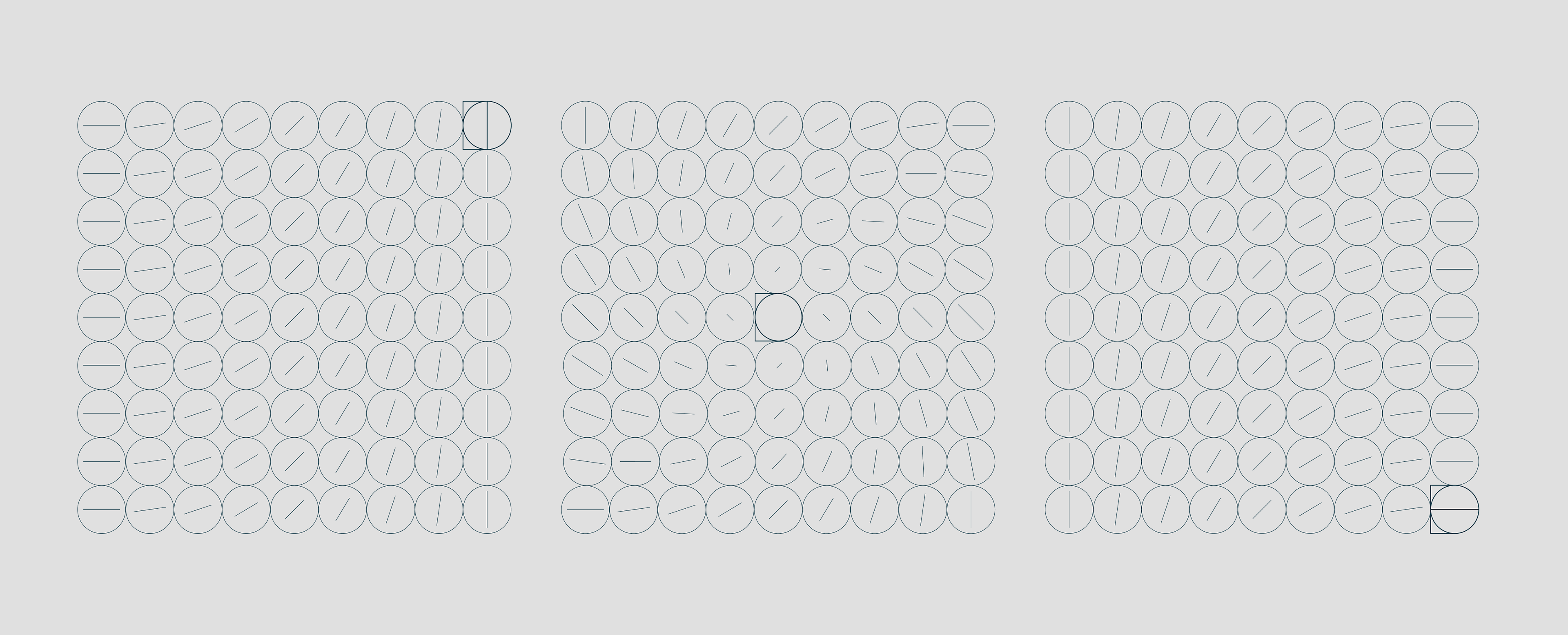
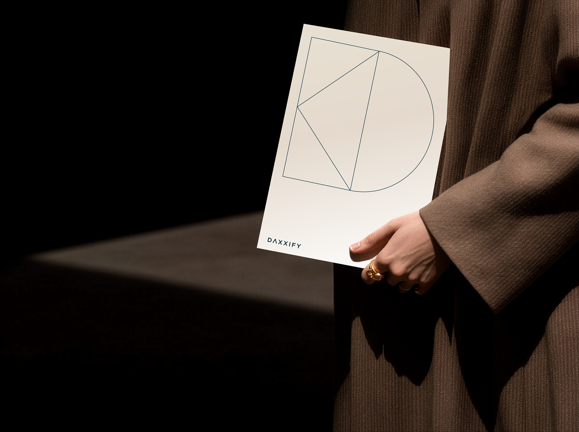
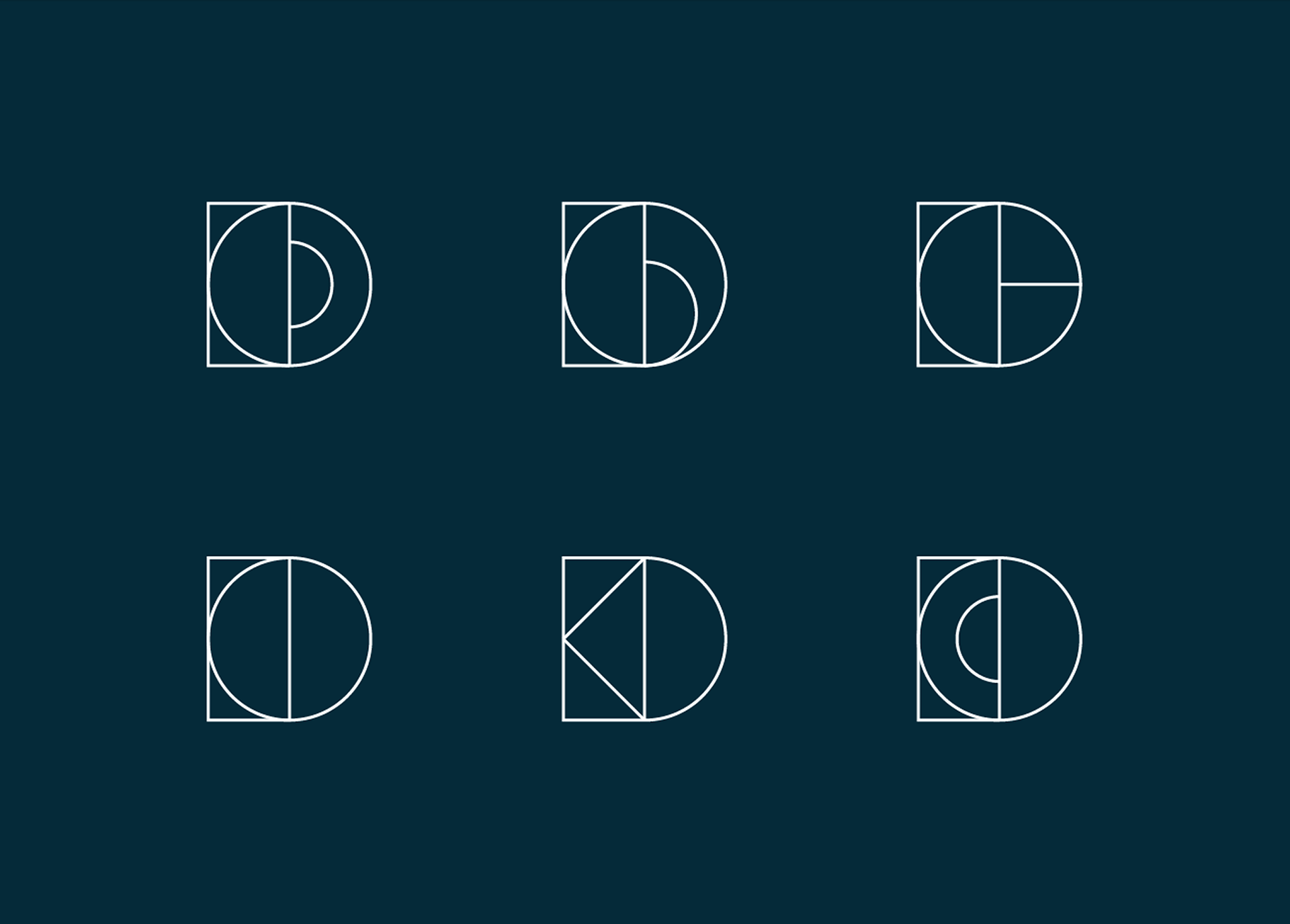
The wordmark strips back to three primitives: a square, a diamond and a circle, held together on a strict modular grid. The diamond reads as a compass point or a faceted, precision-cut edge; the circle closes the D with the same curvature as the spiral it's built from. Together they sit as a monogram that works standalone, long before you reach the type.

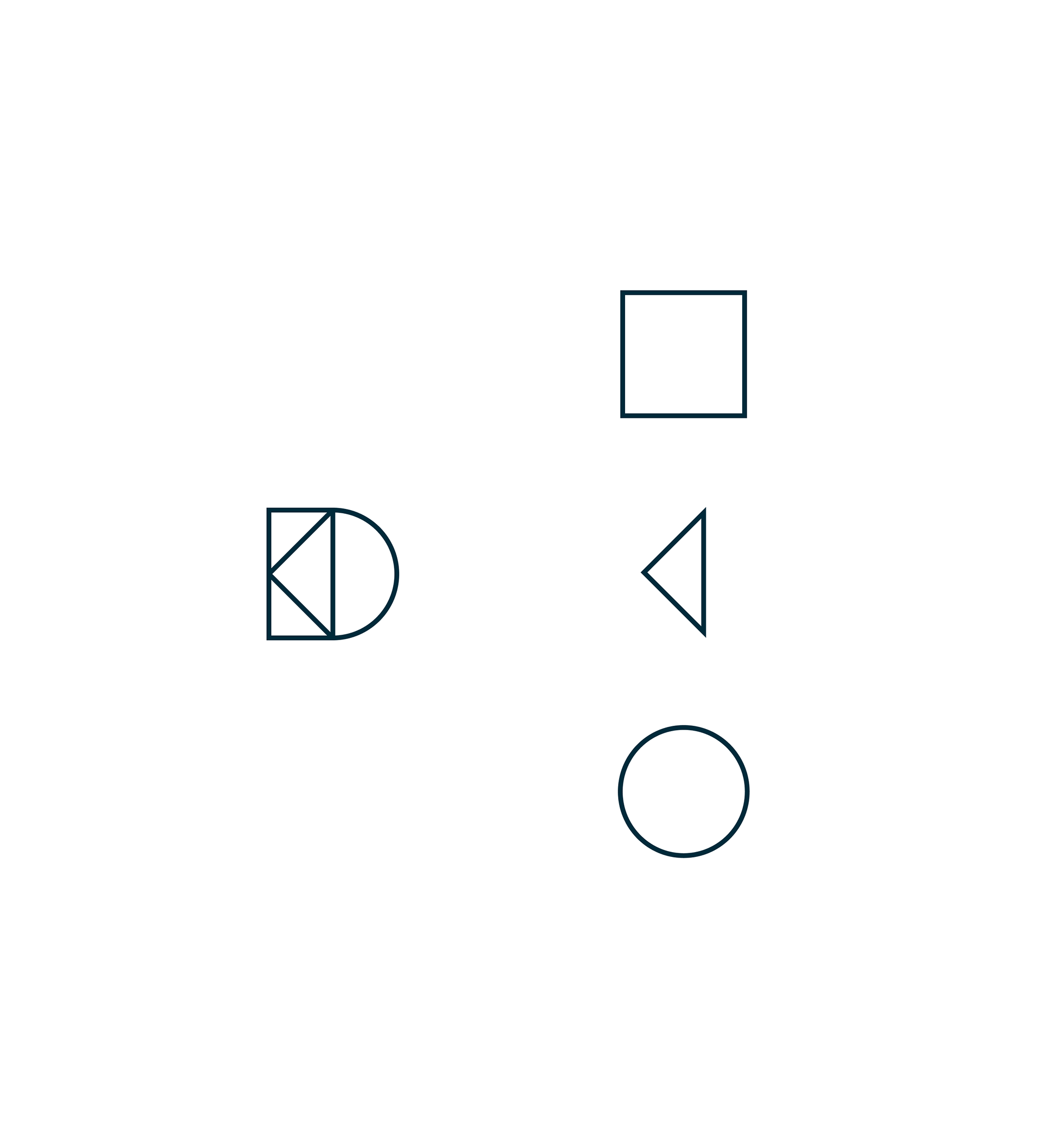
The logomark strips back to three basic primitives on a strict grid: a square, a triangle, and a semicircle.
Square
Sets the base unit and x-height grid.
Sets the base unit and x-height grid.
TRIANGLE
A sharp focal point, symbolising precision, direction, and structured geometry.
A sharp focal point, symbolising precision, direction, and structured geometry.
Circle
Closes the form with the exact curvature of the golden spiral.
Closes the form with the exact curvature of the golden spiral.

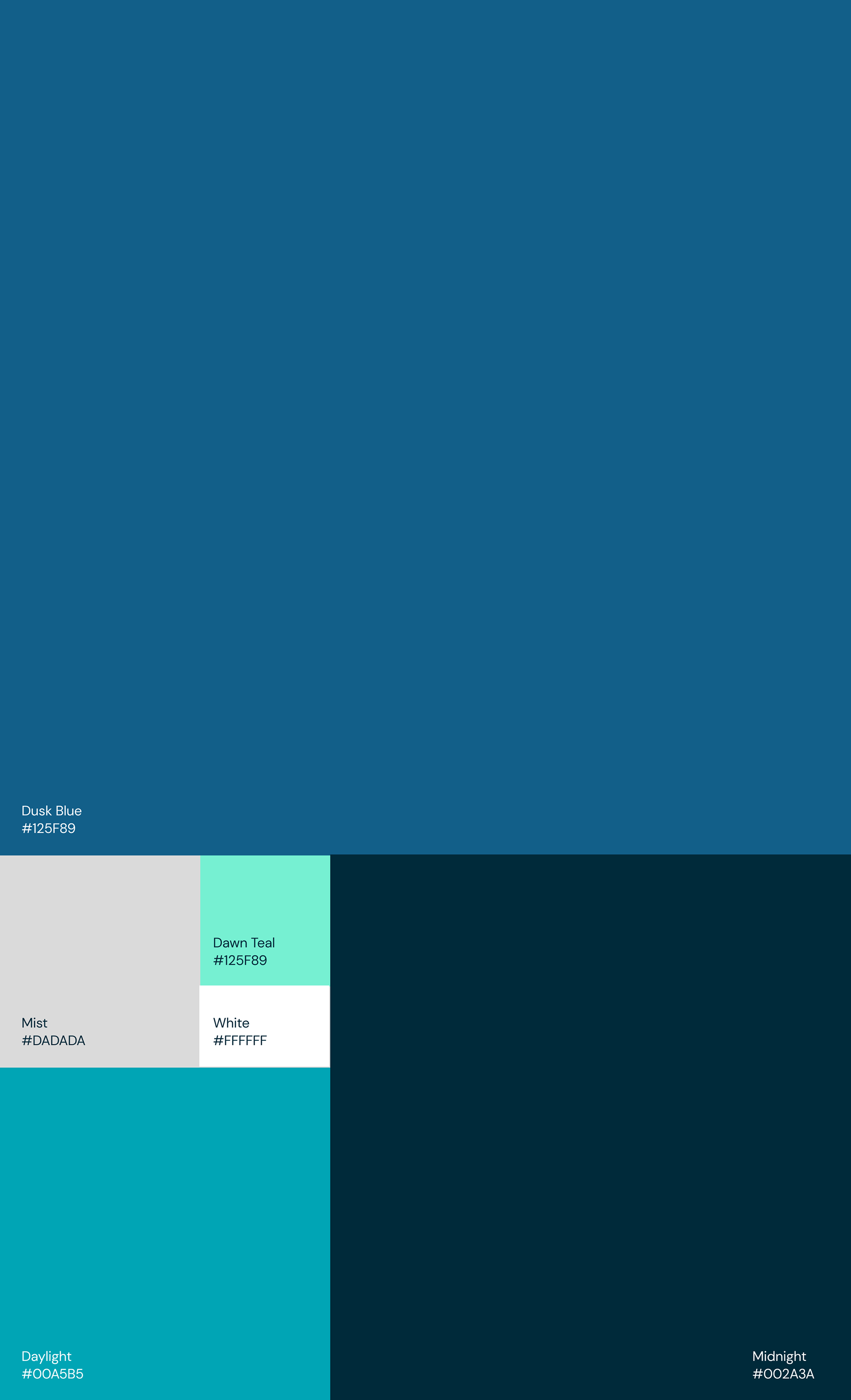
A palette pulled from a wave, not a swatch book
The palette bridges clinical trust and coastal warmth. Deep blues, Dusk and Midnight, anchor the foundation, while Daylight and Dawn Teal inject vibrant energy against a clean backdrop of Mist and White.

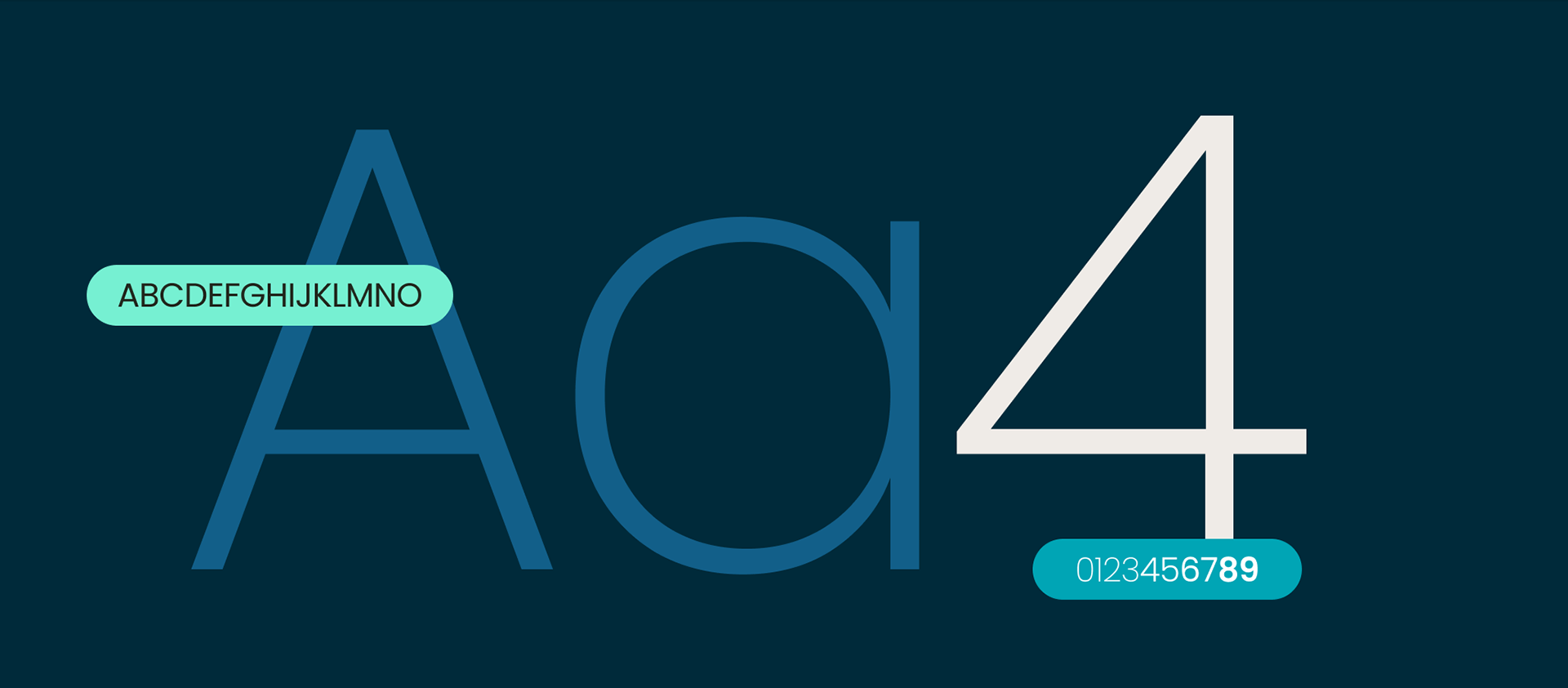

Bringing it to life
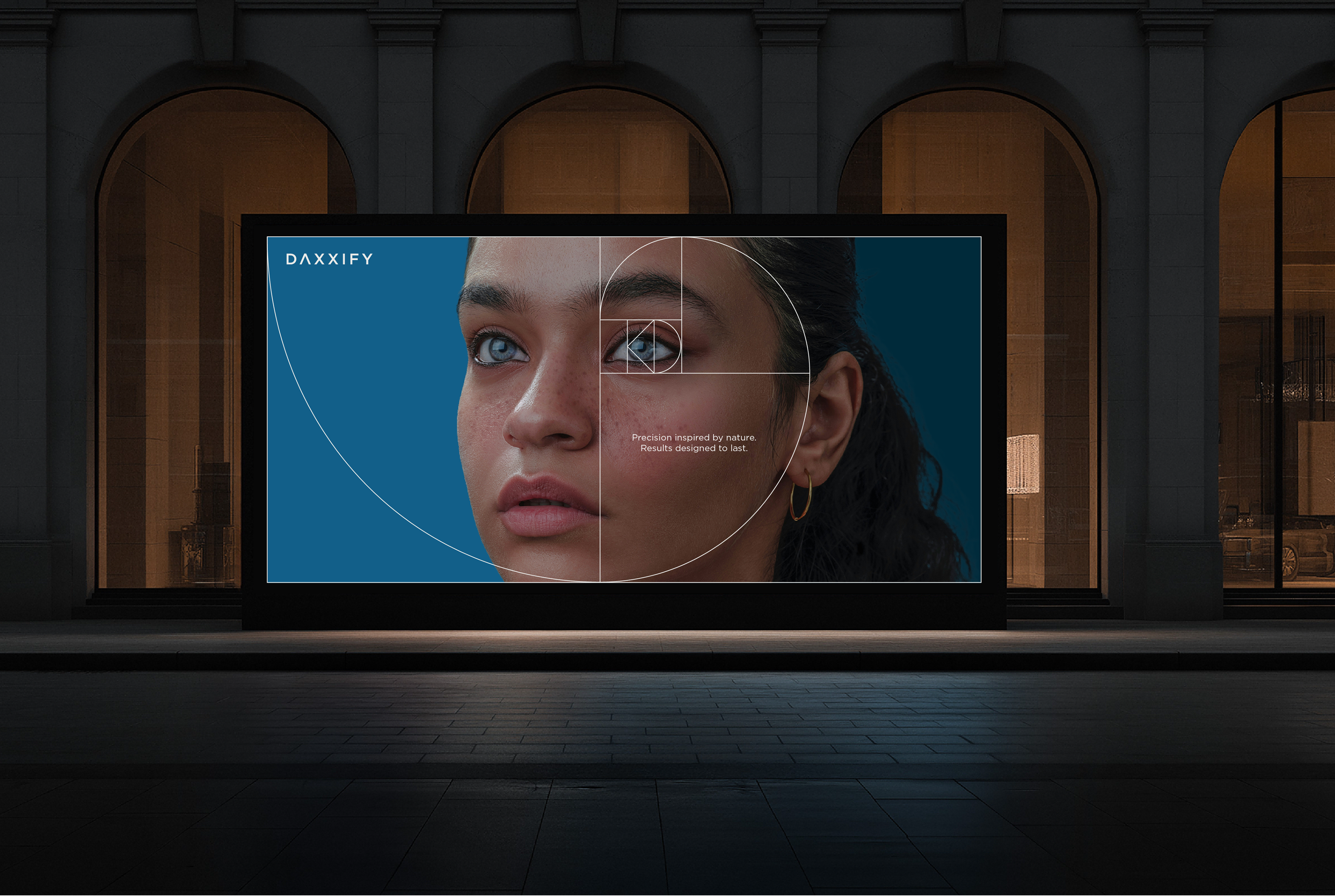
The system had to scale seamlessly from a business card to a metro billboard. The Fibonacci spiral acted as our visual anchor—framing an eye, a cheekbone, or the exact line Daxxify is designed to soften.
On large-format ads, the geometry framed the portraiture so the headline could stay understated: Time is on your side
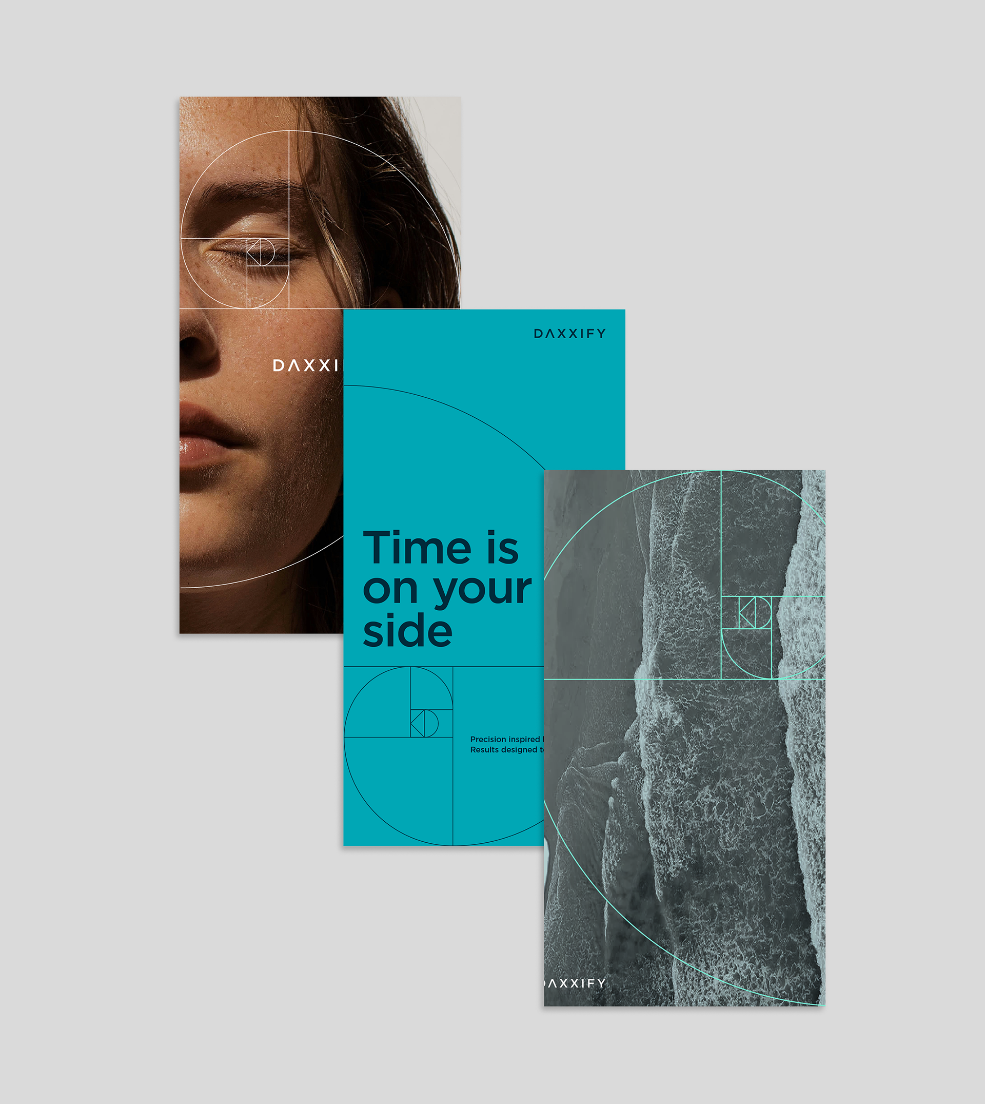

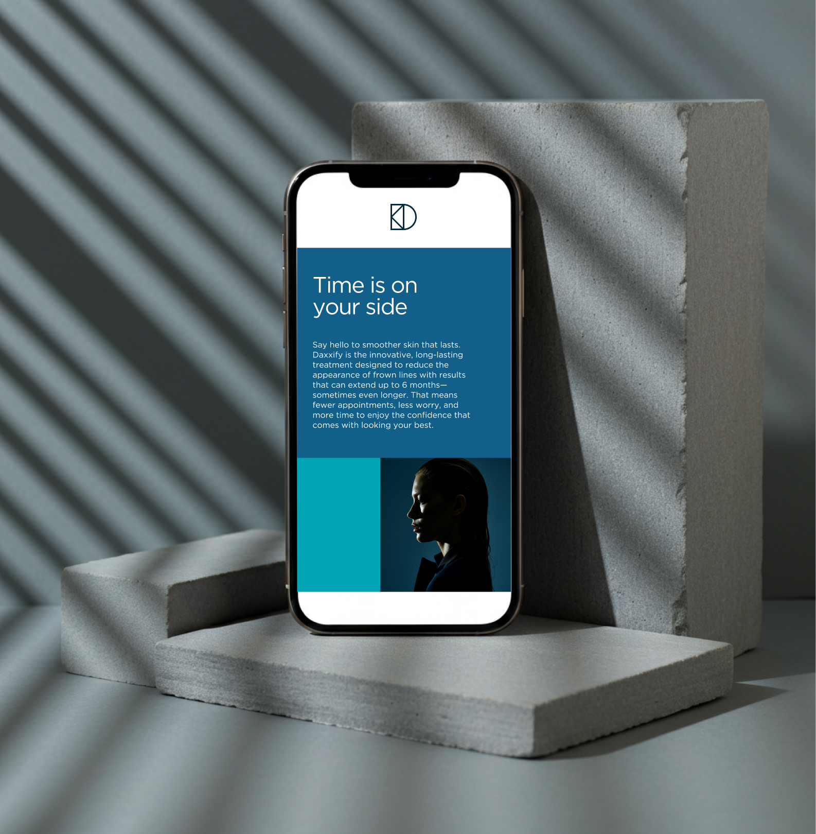
By grounding the identity in mathematical truth, Daxxify gained its ownable visual language: precision the audience senses in the layout long before reading the science on the page.